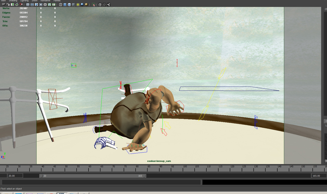
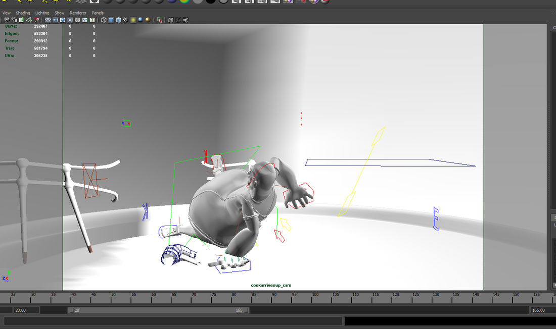
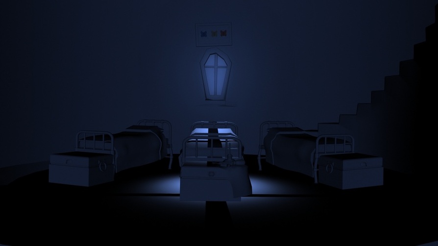
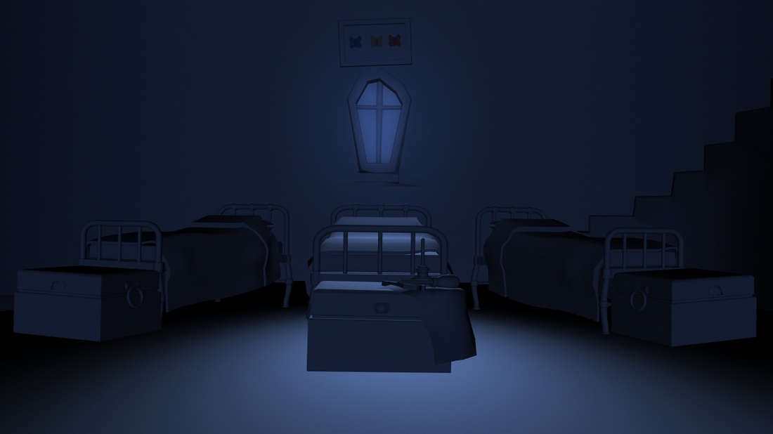
Final editing of the film 03/06/2012 by Sinead
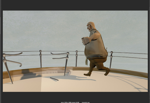
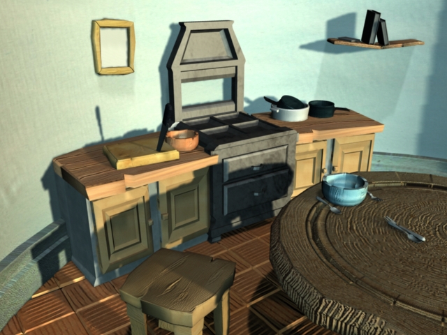
We have been going over our files and applying the final post processing from things such as masking the feet of the cook as he runs up the stairs, to the topaz simplify effect on the sea renders to create a paint like seas, reflections and refractions of glass as well as rays of light and color corrections of scenes to create a fully finalized piece. Below are some examples of some of the post processing results.....
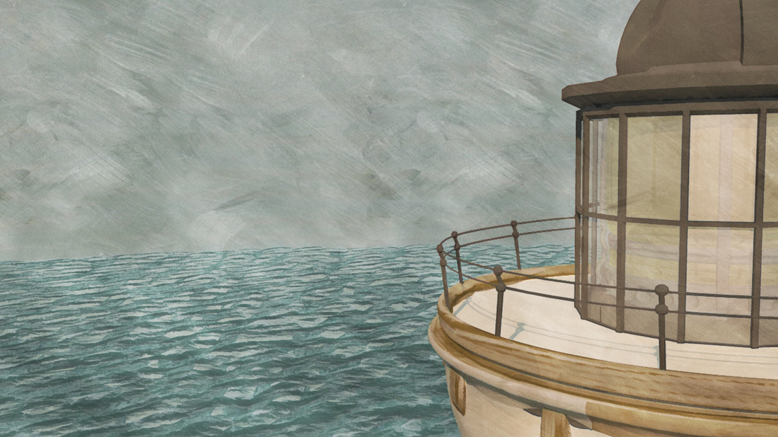
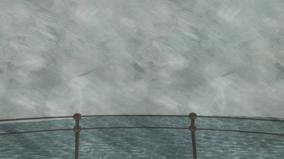
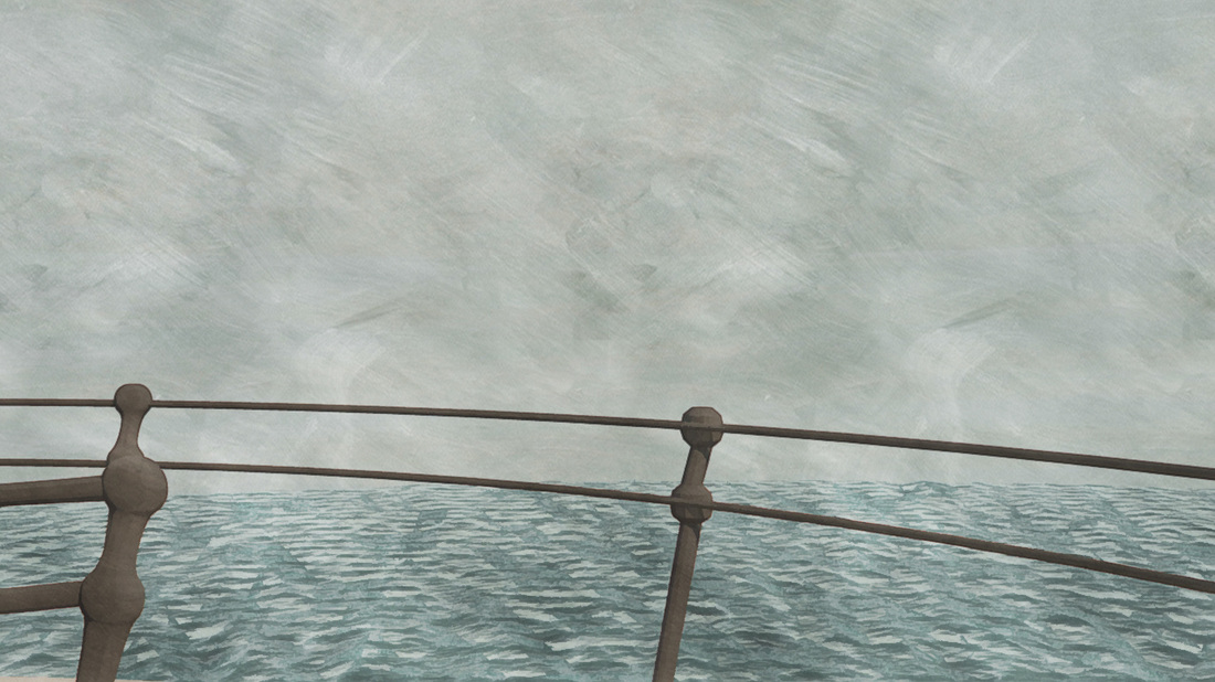
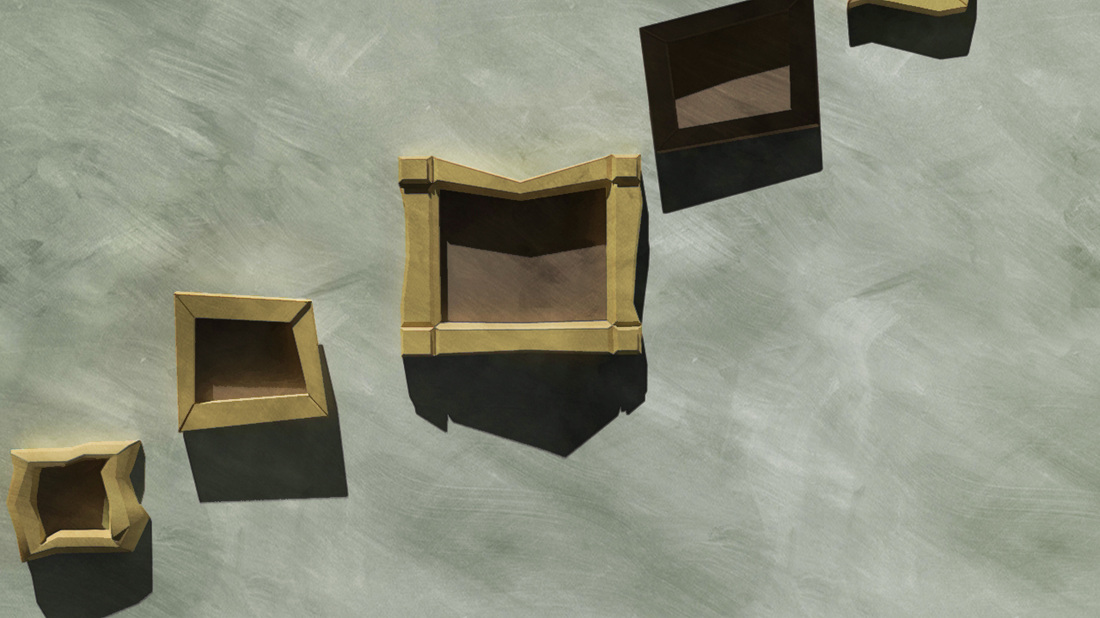
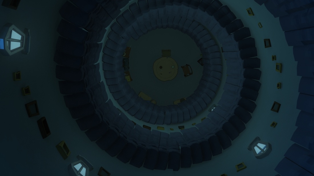
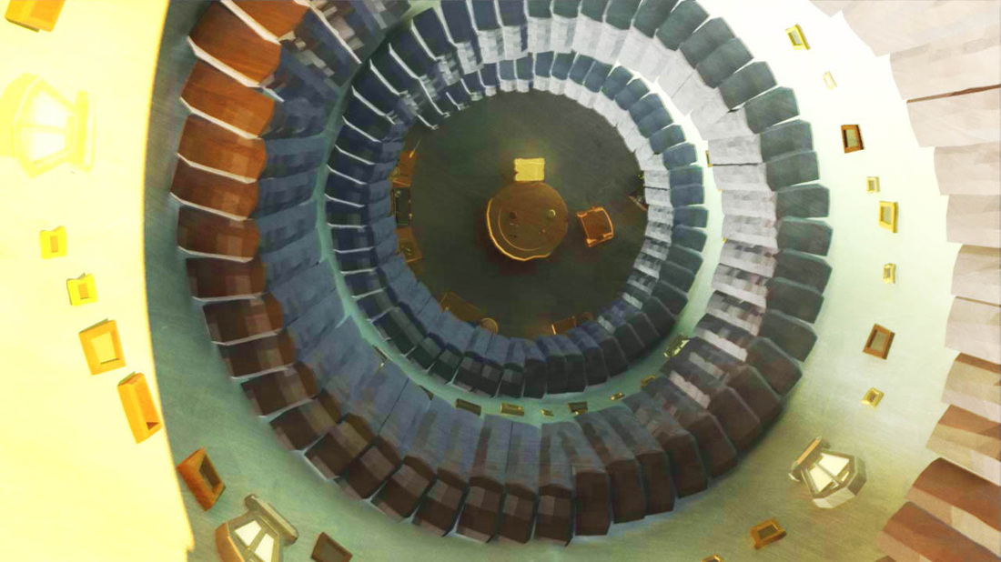
Shot 60
Before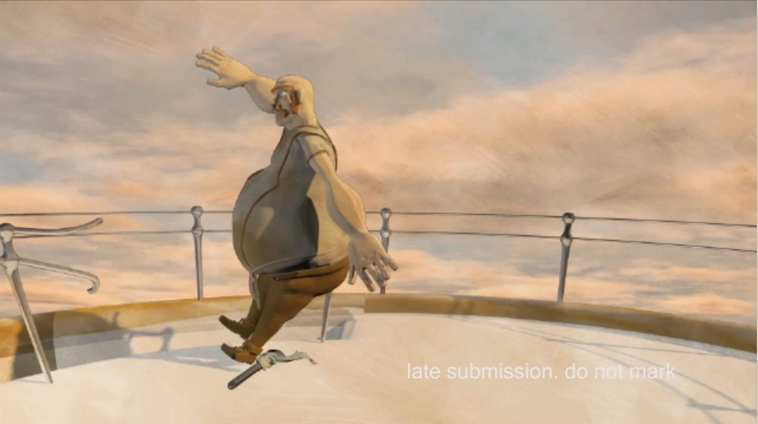
|
After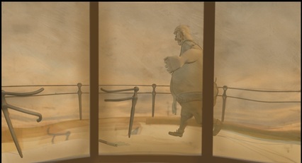
|
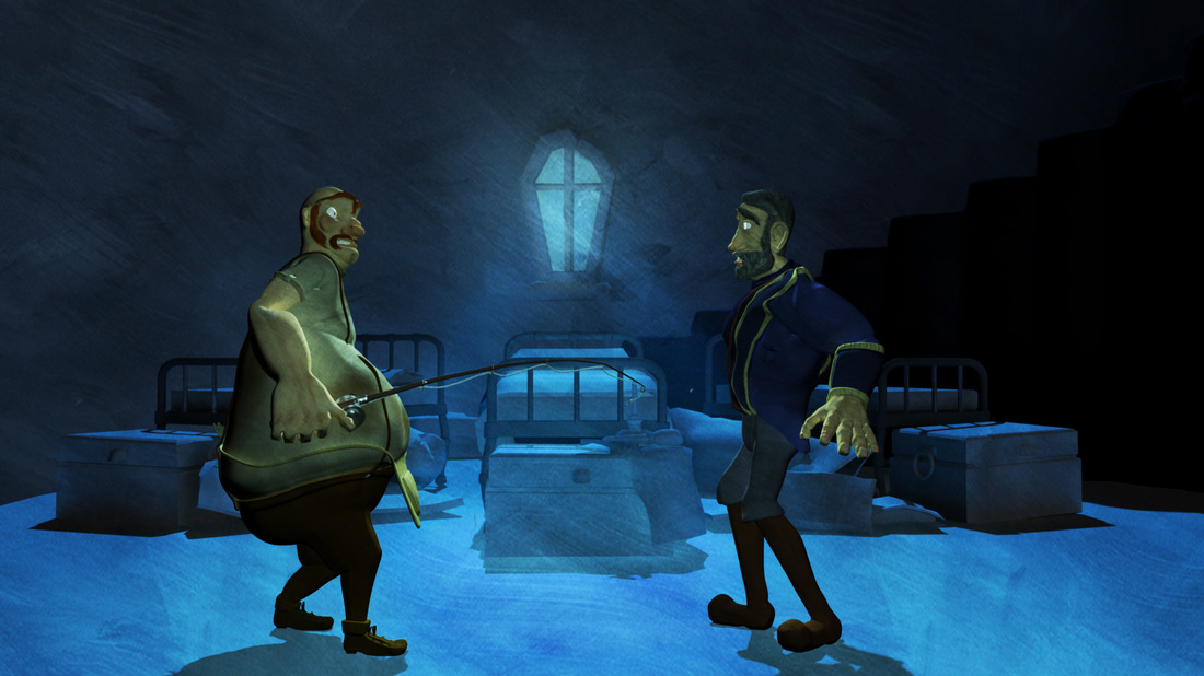
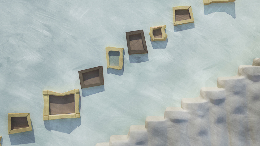
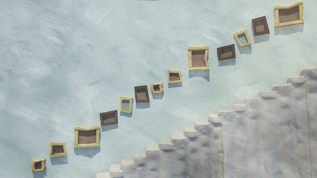
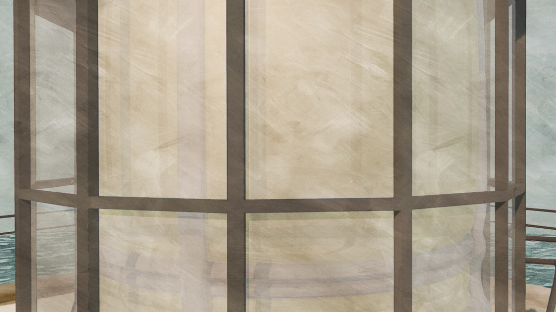
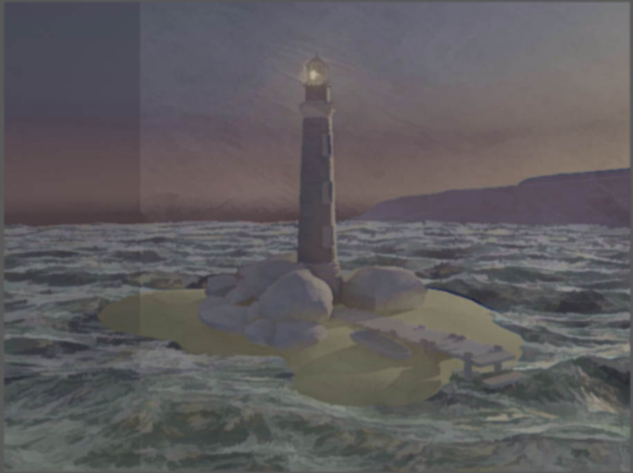
Shot 60 looked a bit naff after its initial export from Maya the scene was meant to be looking out from the lantern of the lighthouse perspective. However it made no sense visually we decided it would look better and hide some flaws with the animation if we made a window frame from maya and added it too the scene in after effects. This made sure the audience would think they were looking through a pane of the lighthouse's glass. To simulate this we first added a window frame rendered in Maya. We then put the frame together with the footage into after effects. We added some grime to the window with photoshop then made the glass effect by using the bulge and cs glass tools in after effects.
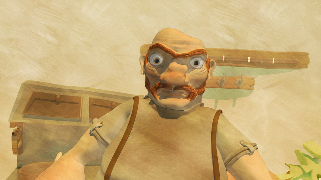
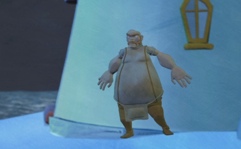
Shot 5b
Before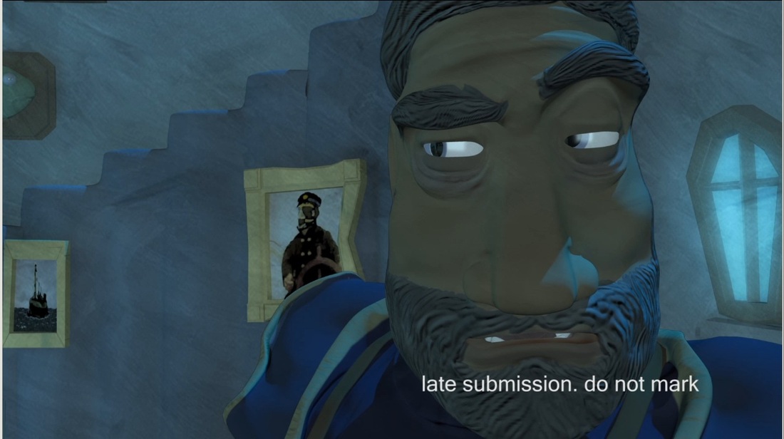
|
After
|
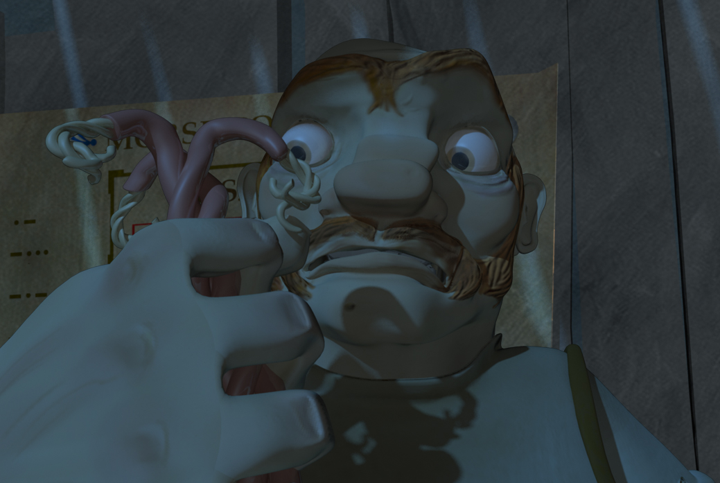
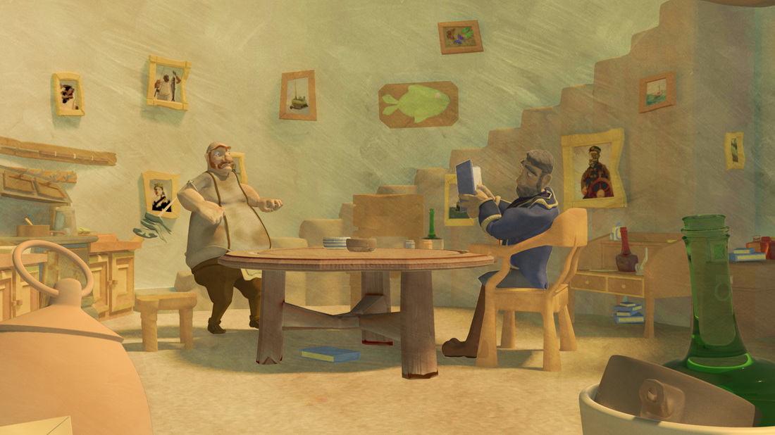
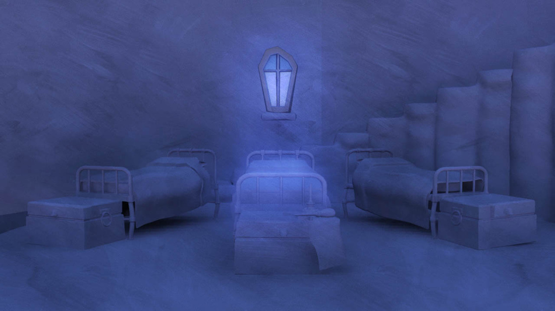
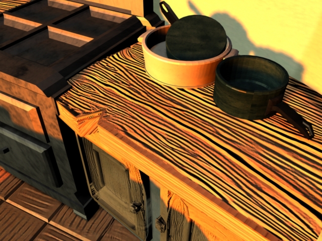
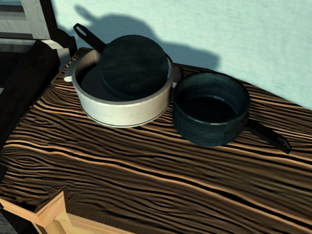
Shot 5 was far too dark and dreary in the original render. To make it far more interesting we have added a beam of light, adjusted to colors with hue and saturation and added a dark gradient to improve the atmosphere of the room. As in the case of every shot the levels and hue and saturation of the characters were changed to make them seem more "in" scene. As we rendered in layers (for example the character is on one layer fully animated, the background is a single still, as would be done in 2d traditional practice) to save on memory and rendering times, it meant we had complete control over every element and could change smaller elements in scenes with ease.
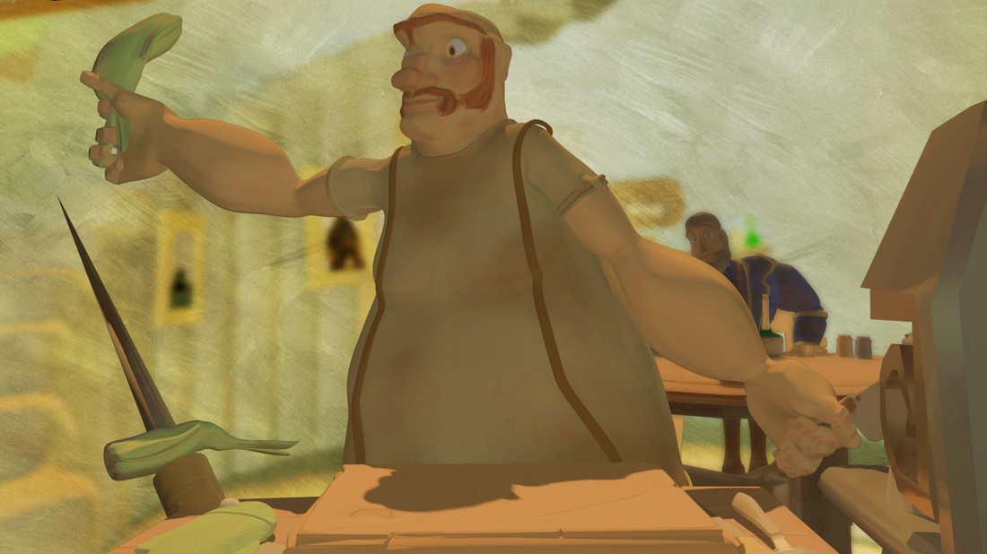
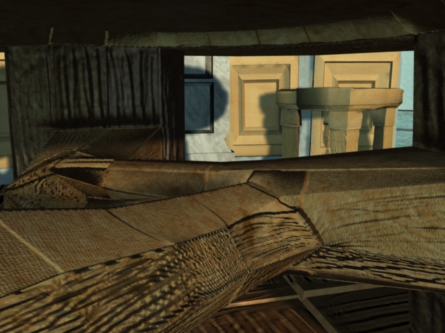
Binocular shot
Before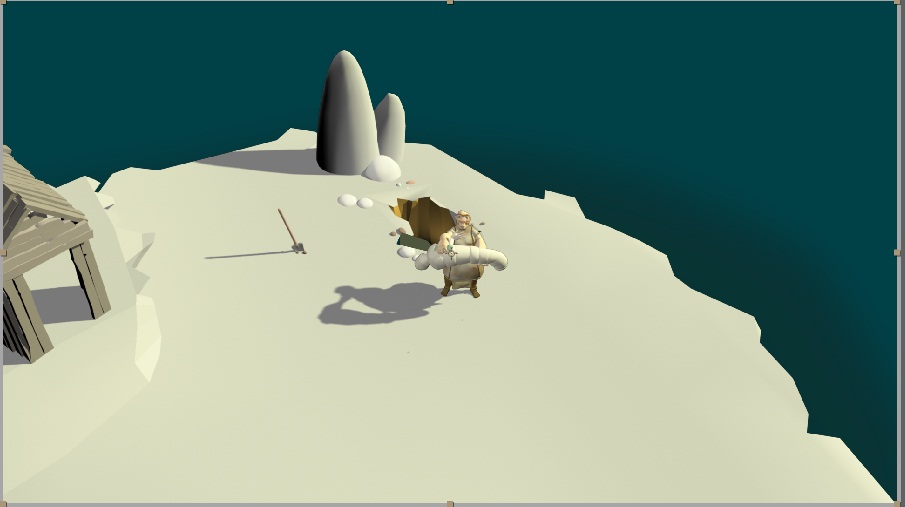
|
After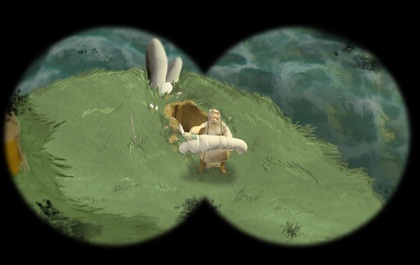
|
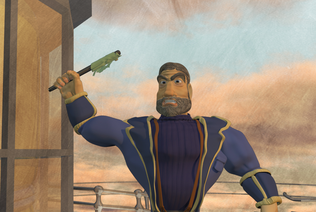
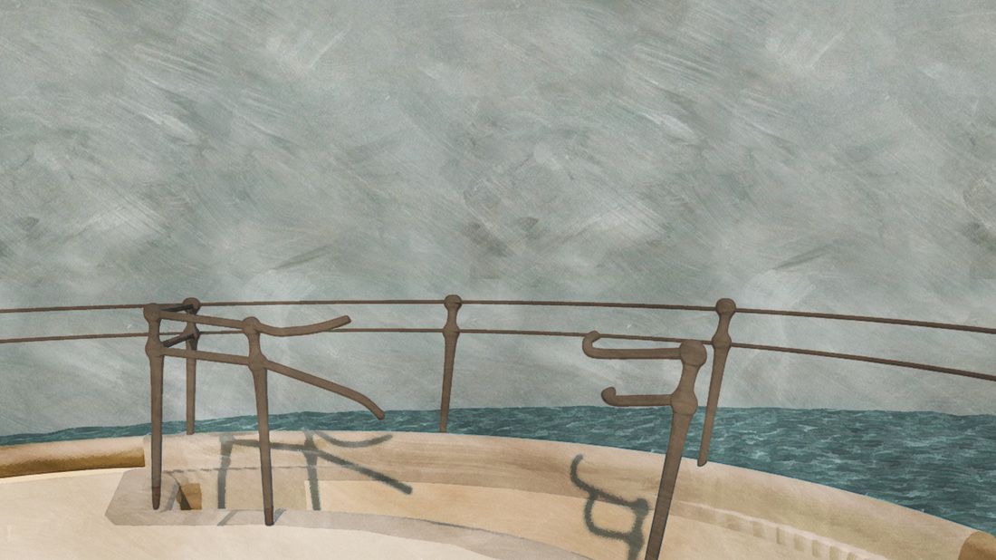
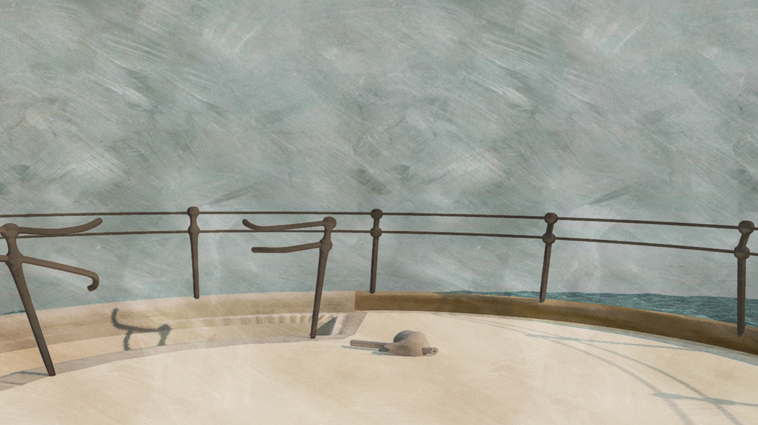
Above you can see the binocular shot. This is the shot from the captains point of view looking down through his bonoculars at the cook. You can see the original export on the left. Some of the day shots are among the most chamged. Firstly we drew a grass layer in photo shop we felt cg grss didn't fit our world enough to be included. This shot also has sea. To make the sea into the lovely painterly one you can see behind the cook we ntook all our sea renders through after effects ans photoshop. The sea files were batch rendered in photoshop to have a filter called topaz simplyfy applied to them. This is the same filter used by the makers of that twinings advert. In this shot the files were then brought together in after effects. we added a binocular vignette made again in photoshop to represent captains looking through his own binoculars. We then added buldge efffects to make the cook look magnified and distoted. As if he was behind glass of the binoculars. finally our painted texture was added to all stills and animations .
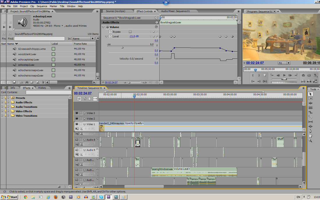
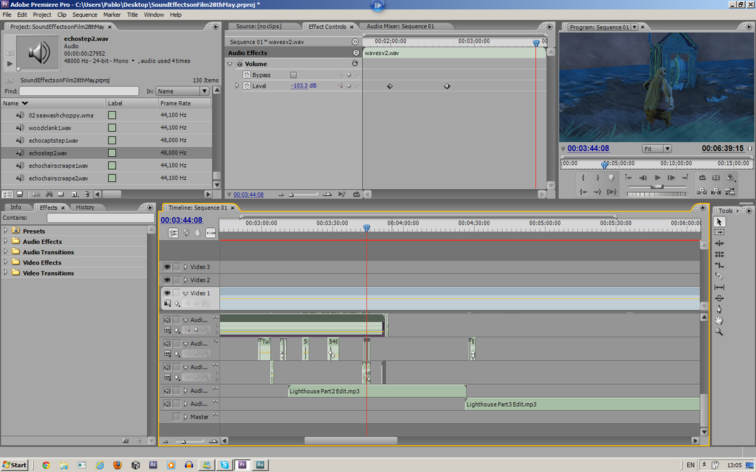
Sound Editing 01/06/2012 by Pablo
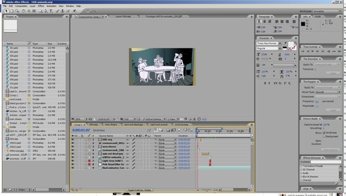
Have been working on sound primarily for the last week in order to finalize the piece as we've intended to sometime I have been adding a variety of voices consisting of hmms and ahs to emphasize the cook and captains emotions as well as an environment track consisting of a variety of wind/seas/seagulls to complete the offshore island theme. For the most part we recorded the majority of sounds from shuffling of coats to go with character movements, footsteps, voices, birds, seascapes, punches and tackles with some recording software and edited them in Adobe Audition for pitch/reverb/noise reduction editing however we decided to acquire some additional sounds which we found hard to acquire such as quality wind and sea tracks as we didn't have much luck getting these sounds without having distortion with the equipment we had available. We've acquired these sound from freesound.org and have credited the people accordingly. We've been arranging it in premiere as that is what we knew best and adjusting the levels accordingly to the soundtrack.
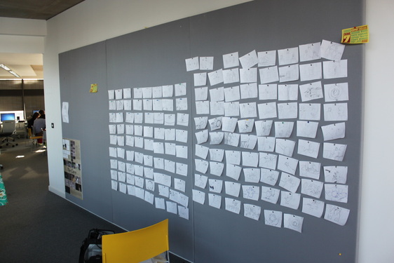
Some images below showing the large amount of audio tracks used and the process as a whole
Showcase and Hand-in 15/05/2012
Had a really good response from our peers at the 15th of May hand in and critique. This was the time where we voted on the top ten films in the year and the top 10 would be chosen to represent the year and be put on the special dvd which will be given to festivals and promoted by the university. We also had to write little notes on the films, I used them to remind me what I thought at the time before voting at the end but other used the comments space to give feed back to others. The below is the feed back we got:
"Bowl at table is great
Keep it simple rather overanimated in places..
Very good combo of media
Add more foly sounds
Visuals amazing, story unique, love the music
Love it – maks much more sense now..
‘fricking awesome – please complete it!’
Overall the feed back as you can see is good, in some ways I'm glad it seems "over animated" as we struggled with people telling us our animation was crap. Not only at Christmas time stage but a few weeks ago when we showed it to leonie. It was clear the shitty animation really needed touching up the timing was bad. Overall I think we solved the animation issues before this hand in. And the film is as clear as I think we're going to get it although we have added some more "shadow" puppets to make the fact that their suspicious of each other finally crystal clear. I feel this is as obvious as I WANT to make it. I don't want the entire thing to be completely devoid of thought and be completely obvious to everyone on first watch.
Though there is very little actual mixed media in the piece so far a few people have assumed the backgrounds are 2d. Which means our style is clearly working. The only 2d element in the piece is the grass which was drawn in Photoshop, apart from that the entire sequence is an in Maya job, including the shadow puppet sequences. I'll go into farther detail about the shadow scenes and how we composited the film together in a later post.
WE now have until the 7th of June to hand in the film for marking, due to Pablo's on going illness.
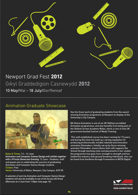
Publicity Update! 11/05/2012
|
Just took a look at the graduation show brochure! It has a great still from the film on page 14. Unfortunately they got the name of the film wrong calling it "This Lighthouse" rather than "The Lighthouse Men", but it looks good in print and works as some good advertising for the film anyway.
It gave us a good excuse to update the Facebook publicity page we had going on for the film with some new pics. Final Look Business Cards: |
|
Final Look and style 05/05/12
Thought We'd update the site with some up to date examples of the style and look of the film, since we haven't shown something visually of the final style since March. As you can see some scnenes have changed more than others since the final lighting and of course the scenes look totally different with the characters in scene.After the last rough cut where we showed some people they said the texture on both the characters and the backgrounds made the characters look see through. To remedy this we've added a subtler smaller different texture on the characters so they "pop" more in scene.

A Journey In Style
Top Of The Lighthouse Style in March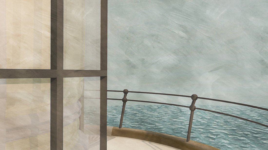
|
Top Of The Lighthouse style in latest cut.
|
As you can see the top of the lighthouse has changed drastic-ly in the last 3 months. We wanted the scene to have a warm dawn feel and there fore added warm yellow lights and changed the colour hues in the physical sun and sky and took the multiplier down in the settings, this took the style from the daylight quality we had on the left to the warm dawn scene on the right. Another of the major changes here to improve the look was the changes we made to the sky. Firstly the clouds were made in Maya's own particle plug in. Pablo made these clouds then rendered them, they were added to the scene in After Effects. The colour of the sky was also changed, this was done by rendering the original sky out in a yellow hue then making a copy of the sky changing the colouring to blue and then blending to two together. These few subtle changes meant we went from the flat plain blue sky and scene of March to a newer better version that is n the final film.
Post Rough Cut Edits 23/04/12
Our process over the past 2 weeks has been a process of cutting the film. Seeing what works and what doesn't then reanimating the sections that require tweaking before again adding them to the scene and re-cutting. We've made about 5 cuts thus far and are continuing this process until the 30th of May before concentrating on the spot effects sound and the publicity material.
Throughout the cutting and editing process we have realised certain scenes are hard to read or just confusing. To remedy some of the most common mistakes and confusions about the film we have decided to add new shots and edit old ones.
One of the main points of confusion was the discovery of the body. As the shot was entirely shot from above the viewers weren't reading the characters as in scene. We decided to add 4 new shots to that scene of the cook and captain running in then their reactions to the body before one more shot of the two looking at each other suspiciously.
We also re shot some scenes from other angles to make things clearer or to hide certain unsuccessful things. Such as the pier scene as seen in the video below.
Here are some quick play blasts showing our newer scenes after our critique suggested that the story wasn't reading entirely. We've decided to include more shots showing the initial discovery of the engineers dead body as well as a variety of camera angle changes with some of our original shots as they weren't clear enough on our initial cut. We are planning on addressing the first half of the movie up until the segment up until the segment where they leave the lighthouse to escape. We are planning on streamlining the first day as well as lengthening the bedroom scene to allow their suspicions to be more clear via an agobe effect.
Composers and Music
Composing the film has been very easy thanks to our composer Steve Dunne sadly though due to my illness and errors in reading our film we've had to compromise quite severely and give our composer segments of the film piece by piece. Luckily due to the extension this might work however the illness has placed both of us in a very difficult place.
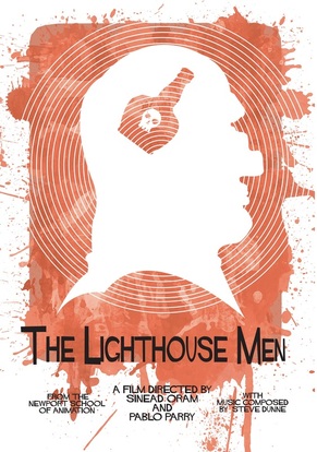
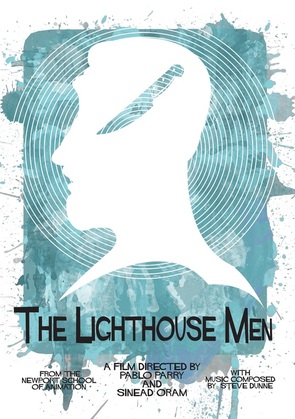
Promotional material...
Film Poster
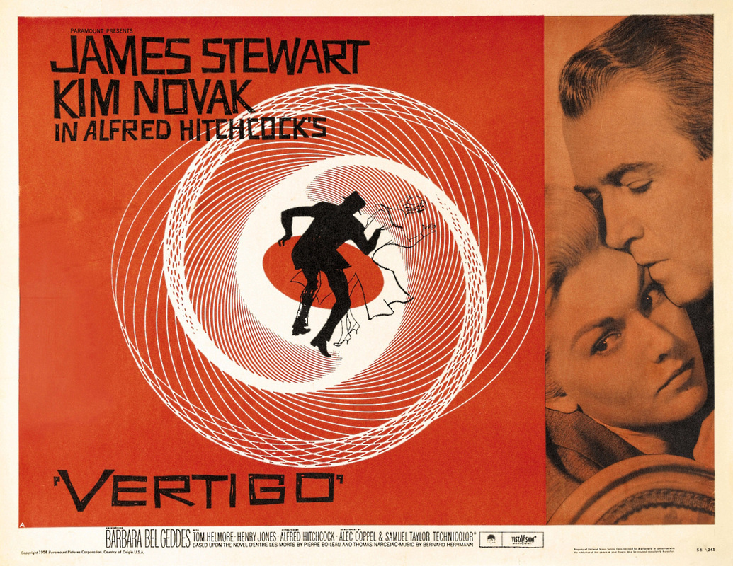
We decided to take inspiration from Hitchcock's film poster design. As the film it's self as heavily inspired by Hitchcock and the Coen brothers, e felt it right to pay homage to their design sensibilities in out print work as ell as our time based media work. The poster for the Coen's burn after reading as also heavily inspired by Hitchcock's earlier designs so it felt we were following in good foot steps. This was also a good opportunity to explain a little about the film before someone would see it, hopefully the Hitchcock influence would hint at the films content preparing the audience for its unusual story line.
Below are three of the designs which inspired this one.
Below are three of the designs which inspired this one.
|
|
|
Postcards
|
|
Here are some of our final designs for our postcards for our promotional pack. We're hoping to create another modernist style poster to fit in with these postcards as well as a large a2 poster featuring stills of the film hopefully maintaining the poster styles from the films which inspired us.
Business cards
We've both rendered a few 300 dpi stills of the film to show off our characters and certain scenes we enjoyed working on during the production stage. The final cards will arrive on May 17th from Moo.com and have rounded edges, feature one of the stills above and below and have a back similar to the postcard designs and feature our contact details.
Sineads Business Cards 07/04/12 |
Pablos Business Cards 07/04/12 |
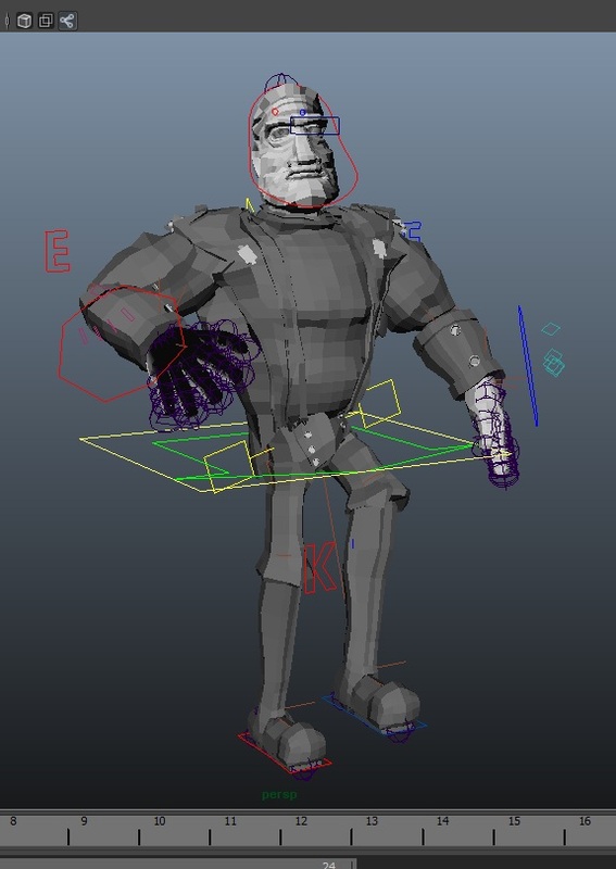
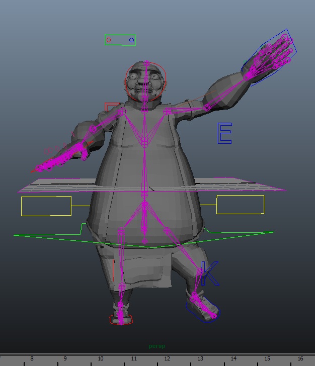
A Quick Run Through The Animating Process 26/03/12
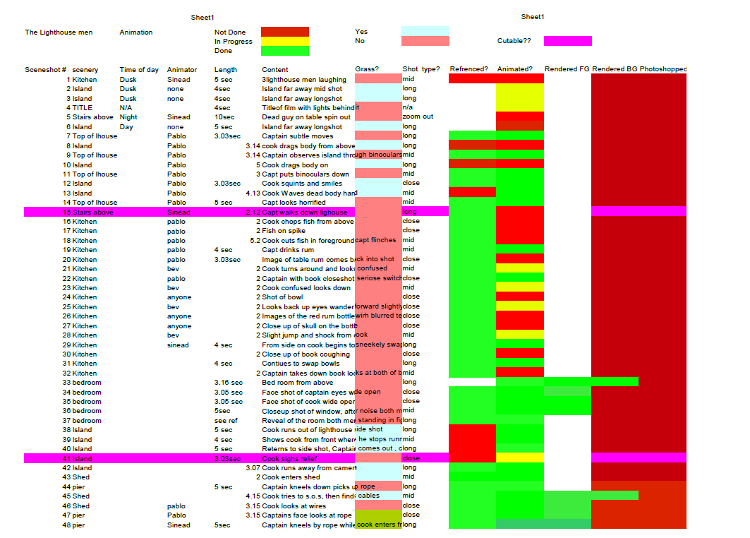
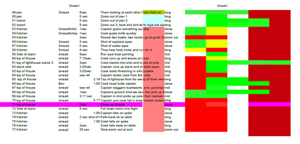
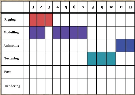
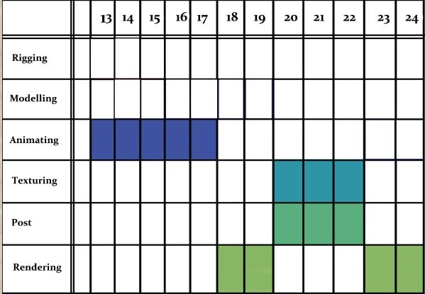
To start the process we each have a schedule containing a list of animations we have to do for the film. We start the process by opening a blank scene then importing the characters so we can begin the animation process. You can see the shot list below which was updated 26th of march, this list tells us how long the shot should be according to the animatic, whether there's any filmed reference already to use, what happens in the scene and who should be animating it. It also tells us the number of the shot which is important for us to name the file.
|
|
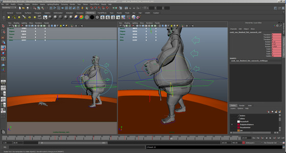
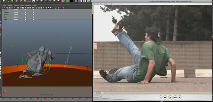
Depending on the length and complexity of the shot we either choose to animate straight ahead or pose to pose. For the scene below I used reference found on-line of a man falling off a skateboard for the scene where the cook character falls over. I then choose key frames and roughly positioned the character and the frame in the time line. After keying the animation I then made the poses more extreme and changed the timing as to make the animation more "cartoony" rather than realistic. This is the general way we animated scenes such as runs and more complicated movements like the fish chopping scene. For scenes with more simplistic movement like smiles or looking through binoculars we animated straight ahead.
|
|
After completeing the animation we add the texture maps make sure their right and in the correct place and that there were no visible mistakes on the map. If the characters in the scene are dead we give them a slightly different map covered in dirt and blood to make them look dead. We then light the scene making sure it matches the rest of the shots in the sequence. Below you see the lights and maps being added.
|
|
The final rendering result:
The final render looks something like this. As you can see there are still one or two issues with this render the area lights put in both have created some weird shadows on the left of the lighthouse. But this image gives an example of what the render looks like before the Photoshop post process has taken place. When we render to save on rendering times and to make it so the post processing takes less time, we
Texture On Characters Test
The captain stares from Sinead Oram on Vimeo.
Reference and animating
To help with timing and such on more energetic scenes, we've referenced all the movements. Here is the scene where the cook is hiding behind the lighthouse waiting for the captain to leave. The animation is below.
We felt it was a better idea to reference so we'd hopefully get a better idea of the animation timing and movement. Although such things as falls and fights were done with reference found on-line so that we didn't break anything throwing ourselves down stairs.
We felt it was a better idea to reference so we'd hopefully get a better idea of the animation timing and movement. Although such things as falls and fights were done with reference found on-line so that we didn't break anything throwing ourselves down stairs.
Animating from now on in 19/03/12
|
From the 7th of march we began animating.We have an individual schedule of animations which cuts our 77 shot, shot list in half, to about 35 each. Today which is the 19th of March we have about 22 of these shots done!
However due to Pablo's illness we're rather behind schedule but its a little impossible to tell how far behind or how unlikely this is to succeed right now. We have a rough end of animation date of 5th of April, where we have to stay away from university for 5 whole days due to Easter. We are planning to post-process everything we have so far at this point. Only at this point will we really see the impact of Pablo's illness. I believe we can still catch up to the animation we lost time on but the post processing might have to be done post hand in at the moment. |
|
Grass 2d Tests
We've decided to handle the grass by making it in 2d this will then be handled by some helpers we have. Above are some examples of how the island would look with the 2d grass on, and then with the texture on. As you can see the flatness of the grass really does look good once the texture is added to give it depth.
Render Test 16.02.12
A rendering test for a key scene in my final film =p
The above test is the same scene played twice with the Photoshop filter post processing on both versions of the shot. First it's played with the filter on top of both the character and the scene the second is the same scene with the post process only affecting the background scenery. We decided we needed to try both for clarity in the scene and needed to ensure that the characters were still readable and clear from far aw
This weeks lit and test rendered scenes, 08.02.12
|

|
Character Updates: Eyes and redone colour maps for cook and engineer
Rendering test 06/02/12
This Week's improvements, 03/02/2012
|
This week we have taken the opportunity to really get involved with our scenes and change anything that needed fixing before we go into animating in two weeks time. Our animation dates start on the 17th of February and we're animating to stay true to our schedule. The style of the piece has been developed a lot and the overall look we're going for has begun to emerge. The Bjorn look we were desperate to create. (to the right) has almost been realized. To achieve these results we took our modeled men (after last weeks uvmapping, normal mapping and colour mapping) and begun experimenting with rendering possibilities. We discovered rendering in metal ray gave us a really high quality image but with issues as our psd maps were to large to export this made the machinery we were using crash.
|
|
After a little experimenting we found out jpeg files worked and were finally able to export with mental ray we used its physical sun and sky lighting to really give our characters a good look and style. We think this is what our final characters will look like apart from the eyes which are yet to be finalized. Below are some renders using the physical sun and sky and with the final characters wearing their normal and color maps.
I think we can all agree that the colors aren't quite there with the cook and engineer. But I believe we're close some more attention will have to be brought to the cook to make sure he's all up to scratch and at the same quality color wise as the captain. The saturation is too low and he seems washed out a colour scheme that's fine for the engineer as he's doomed to die pretty quickly. But for the cook its well iffy.
We also did some redo's of the scenery this week! Below are the scenes in their almost final stages of render. I've been experimenting with some filters and textures this weekend after researching the look we saw in the twining's advert. Annoyingly Caroline showed us an animation with the style we've been aiming for for all this time as inspiration. It's been pretty hard to get close to but I believe we may be getting close with some Photoshop filters. see below:
We also did some redo's of the scenery this week! Below are the scenes in their almost final stages of render. I've been experimenting with some filters and textures this weekend after researching the look we saw in the twining's advert. Annoyingly Caroline showed us an animation with the style we've been aiming for for all this time as inspiration. It's been pretty hard to get close to but I believe we may be getting close with some Photoshop filters. see below:
Pre Vis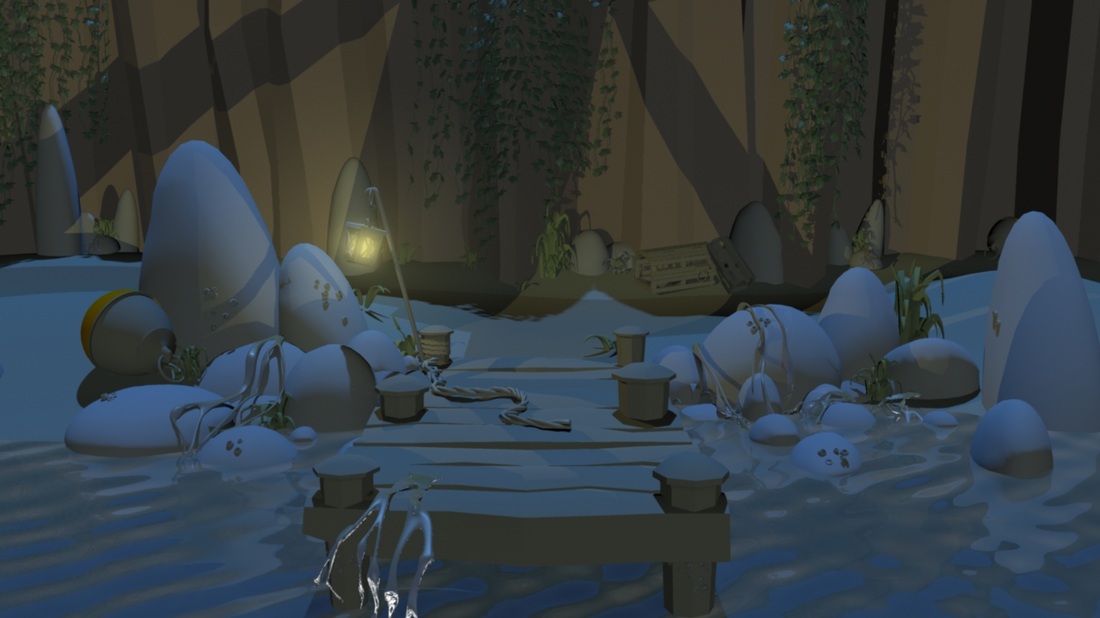
|
Post process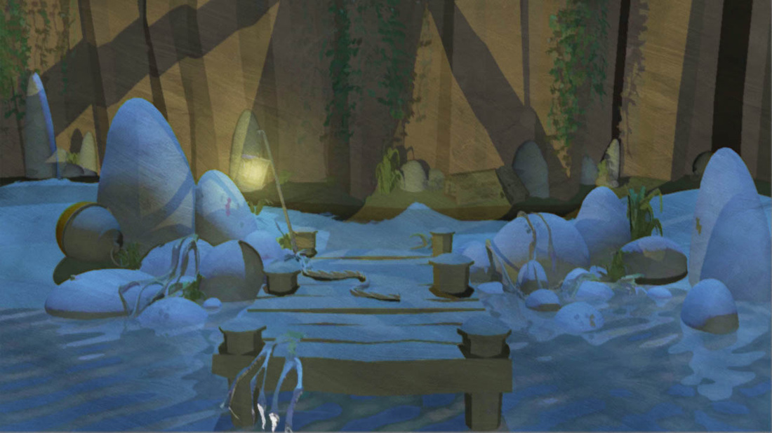
|
This week in a nutshell, One step forward two steps back...
|
This week has been a bit of a roller-coaster we've had some success with the scenes and characters . We've discovered the real beauty of using physical sun and sky and are going to be using it for the entirety of the film it lays to rest some of the serious concerns of the issues we've had with lighting. We also have discovered the Photoshop filters and plugins which we have discovered could make the film the aesthetic we've been grasping at throughout the process. As seen on the right a buy-able plug in makes all the difference to the sea! Scenery still needs a little work though but we've found a solution for the "too realistic sea" dilemma.
However we've realized at this crucial point that grass was far beyond us after experimenting with painted on grass in Maya. We came across a massive issue it didn't fit the style of the film one tiny bit and without the technical skill to make our own pain-table grass we'd found a hard issue to get around. |
|
2D seems to be the only answer taking a look at saga of bjorn again we noticed their use of 2D grass and took note. We have come to the conclusion we have to process the grass in Photoshop for sure and we may have to do the whole film in this way. It's a massive decision which means we will have to use actions to edit every single frame in the entire film. I think it's worth it but we will see if we even have the time for this.
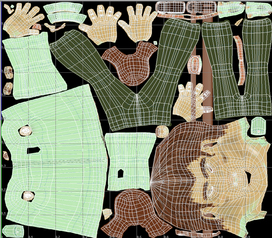
3 guys UV mapping Normal mapping and colour experiments. 27.01.12
This week our concentration has been finishing the main characters models completely so they were up and ready to animate. This mainly included firstly UV mapping them using headus and putting the UV's in to sets. After they had been mapped we added normal maps by putting them into zbrush editing the model then applying the normal map made from the zbrush editing. We also did a rough colour in zbrush before exporting theese
We originally set up the UV maps in sets. But after testing with our Normal map we found they were completely in the wrong place because of the sets. We had to spend a day re fitting the uv's on to one set to make sure the normal maps worked and was in the correct place.
Below are the final UV sets one for each character. Firstly the cook, Secondly the Captain and the Engineer his has the colour on as you can see for an example.
|
|
|
Below you can see the cook in Zbrush. This is after the Zbrush displacement map has been finished and we're painting the UV's with poly paint in Zbrush. We're hoping this will make our UV maps more clear. Our UV maps will be finished with finer details in Photoshop after we're done in Zbrush. For example the dirt on cook's shirt and hands will be added in the Photoshop UV map as well as the finer details of the captains design such as finger nails and the sewn on "K" patches .
|
|
|
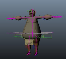
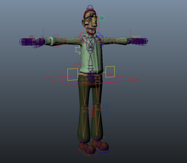
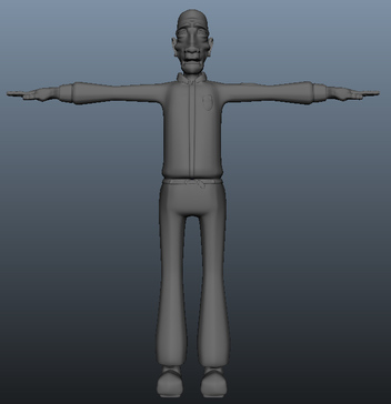
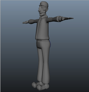
Below is the final 3 characters ready to animate. Their wearing their UV maps and their normal maps and you can also see our rig in the image! It's nice to see this working in Maya. Though we need to make sure the animation still works and blend shapes still look good. Pablo also made the engineers rig applied it to him this week.
We may need to revisit the engineers colour in our next stage, uv mapping and editing colour maps in photoshop.
We may need to revisit the engineers colour in our next stage, uv mapping and editing colour maps in photoshop.
|
|
The Engineer! Modeled and ready to go into Zbrush..
|
|
Latest Animatic Feedback 21/01/12
We spent the night after the last presentation fixing the animatic again. Adding some of the shots back in and taking some out making parts longer and completely redoing the sound to fit better. This below is our latest latest animatic. We needed to make it as clear and as obvious as we could to show people who perhaps weren't as versed in film language and animation. (ignore the fact its in the wrong ratio I can't get used to you-tubes conversion the source file is 16:9)
We constructed the questionnaire below and sent it out with the animatic to a few people who had never seen the animatic before or had any idea about the story or film. Below are the questions we asked:
Did you understand how the first character died?
Did you understand that the Cook didn't see what was wrong with waving the dead mans arm and that the Captain was disturbed by this action?
Did you get that the Cook felt the food was poisoned by the Captain?
Did you understand the Captain was spying on the Cook?
Did you understand both characters were trying to escape the island at night?
Did you get that the Captain and Cook felt the other sabotaged their method for escape/help?
Did you understand that the Cook was trying to signal a boat for help?
Did you understand that the Captain saw a silhouette of the Cook with the broken banister and thought the Cook was attacking him with it?
Did you understand that the suspicion between the two was growing throughout?
Was the story interesting enough?
Do you feel any of the scenes were unnecessary? Any Ideas on improvement?
First reaction: Elinor
Did you understand how the first character died?
I didn't get that there were three people on the lighthouse, so thought this was the first and last scene if you like and the rest flashbackas to how it had happened. Thought that the guy with the binoculars was someone watching from shore when the cook got the dead man to wave.
Did you get that the Cook felt the food was poisoned by the Captain?
No I thought he was desparate for a drink of rum, and the Captain had the rum.
Captain sabotaging the Morse code machine
not sure got this exactly wasn't sure what the piece of equipment was,
Was the story interesting enough?
very, quite gripping
Ideas on improvement?
only to make clearer some of my earlier confusions. I liked the Hitchcockian opening and last scene, and fact it is repeated. it felt very filmic. The sound was good. It had a real feeling of suspense. I wanted to see it again. Loved the tests design and characters excellent.
On the whole some really helpful feedback I think the main confusion with the flashback misunderstanding was down to the black and white of the animatic and that being a trope of flashback story telling. With the captain looking through the binoculars I think the confusion with him being on land would be made clearer in the final animation where we don't have to rely on the rough drawings to display that. The kitchen poison scene needs to be looked at, at present I think it's unclear as we removed some frames that made it obvious but in doing so made it too unclear a shot of the soup looking deadly could help this scene I think. As well as the "Red Rum" needing to look like poison through bottle design. The morse code macheine will be made more clear with some signage and posters in the background of the shed I agree the average user might not read the light as a communication device without theese signals.
Apart from some small earlier confusions on the whole the story was understood and enjoyed. I'm glad the Hitchcock inspiration was felt through the film and I'm also relieved the themes of suspense are coming through.
Comments on 2 viewings (Jaymie)
Did you understand how the first character died?
Yes, he fell down the lighthouse stairs and was impaled on the meat skewer
Did you understand that the Cook didn't see what was wrong with waving the dead mans arm and that the Captain was disturbed by this action?
yes this made me laugh!
Did you get that the Cook felt the food was poisoned by the Captain?
Yes I wasn't a 100% sure if the cook switched the food around though (on first view). Nice Red Rum ref
Did you understand that the Captain saw a silhouette of the Cook with the broken banister and thought the Cook was attacking him with it?
I didn't realize first time around that it was a piece of the bannister. I thought it was a cut throat razor. This is clearer after repeat views
Ideas on improvement?
I think that when it is all animated it will be very clear. At some points ( not many) it was difficult to distinquish between captain/cook. The only other thing I didn't quite understand was why the cook would cut the boat free and then try and call a boat for help. The motives for sabotage were not quite clear ( I assumed it was so the other could not run away and leave them there to die/unable to call for help). Really enjoyable!
Another really informative feedback page. It's good that people are understanding our film even if it takes two watches. We want the clues to the first guys death to be slightly hidden and its nice to see about half of everyone who watches it understands the death straight away. Again the kitchen bowl poison scene is confusing this is defiantly something we need to look at I think as both feedback questionnaires so far find it an issue. I feel the banister problem will be fixed when we've modeled the banister though this prop probably needs extra care and attention to make sure its as clear as possible. The captain cook issue will be sorted once we get the real models on set so they'll be very different from one another we'll have to be sure they stay very different colour wise so they are clearly very different colors.
Test Reel
Reaction
Overall the reaction to the reel was OK as we only finished the rigging and blend shapes 5 days before hand in we set ourselves a load of animations to do to firstly find out where we were having issues with rigging and shapes and secondly to fulfill the brief of 30 seconds of animation tests. If we didn't need to fulfill the brief we probably would have spent a LOT more time on them to perfect them before hand in but such is life. Some points were called up about the head bobbing on the run cycle and such but to be honest I felt this was nit picking as we already knew this was an issue and mentioned before that the animations were super rough and just examples and more proof to show our rigs and blend shapes were operational. A reference point and a show I've actually been a fan of for a while is pocoyo this was suggested by Manning to look at and to treat the animation very pose to pose and sharp and choppy. I think this is a good way to go if a little anti intuitive as in 2d we're used to trying to get the animation smooth! Some new tests using this very different style of animation are in order.
It was a little disappointing that our feedback was centered around animation for the second time I would have liked more feedback on our sets and lighting but this is something to bring up in the next tutorial with the class. Gemma and Jess both commented on our you tube video Jess really liked the lighting in the pier scene especially the glow effect we had on the lantern and I agree I think what works nicely is the blue scheme being interrupted by the yellow orange glow of the lamp.
Issues with rigging and other issues
We have had a few noticeable issues with rigging on our characters. Firstly Pablo noticed after his rigging that the Clavicle bone was missing. This may mean that we have to get the characters re-rigged. We also might have to create a blend shape for the captains beard so he doesn't clip the chest in certain positions. Other than that we have a semi good base right now to work on.
Forth Animatic...
Feedback from last time
In our December presentation Leonie told us that she thought the story was there now but we needed to clean it up timing wise and visually so it made more sense visually. There were a lot of consistency errors in the last animatic also things like bottles and bowls moving around between shots and parts in color and black and white. We decided to put a lot of consideration into this animatic and use entirely cg backgrounds.
Making this animatic
This animatic really showed us what we have left to make in the lighthouse the inside for example really came to light as we don't have a inside modeled out yet. We were told in the crit that this version was loads clearer! YAY! Though we had 2 suggestion to add 2 of our previously removed shots back in. One shot of the captain standing in the top of the lighthouse with the broken banister in shot. We're going to put that back in for sure. Another was suggested we add back in a shot of the spike which we had but removed on Mannings suggestion. We feel that this shot is not as needed and as our current animatic is over 4 minutes we can't add it all. As well as the spike being a feature of the cooking scene so its already planted in the audiences minds.
One More To GO
Pablo was disappointed with the sounds I put in this animatic also he felt some of the timing was still off. So I'm Currently making annother final final final animatic so we can show it to as many people as possible. I have a friend whose studying Production for television in London whose offered to show it to his class. Pablo's mum as also offered to show it to a group of amateur novelists she works with as well as all the friends we have who haven't been roped into seeing it. This is why I held off showing it to to many people in the beginning I KNEW we'd need a fresh audience at this stage to iron out the kinks.
By Sinead
Rigging/Blendshapes 05/01/12
By Pablo
|
|
For the last couple weeks I've been sorting out the UV mapping of the Captain and Cook which has been quite a long winded process and very dull so I wont go into it yet because we haven't created our displacement/colour maps yet ( Waiting to get on those cinteqs for more than 30 minutes). I've moved onto the rigging process. The first rigs for the Captain and Cook took about 6 days in total to complete including blendshapes and weighting. I'm quite happy with the outcome the cook was easier to rig due to his large body parts and more simpler design apart from the apron, The Captain however has got some issues with buttons and other smaller models clipping with the main bulk of the model and I haven't found a way of getting round that yet. However the Captains face is quite easy to deform while the Cook is more of a pain at present. We may look into redoing the rigs in late January but we could use these for the less demanding scenes if necessary. I'll be moving on to creating some tests shortly to test out these rigs. I'll probably go on to modelling/rigging the engineer after that.
(missed out the clavicle_jnt which could be a problem later on I hope not but wish I implemented it now.)
(missed out the clavicle_jnt which could be a problem later on I hope not but wish I implemented it now.)
UV map examples of the Captain
by Pablo |
|
Making the newest animatic *now with added cg* 07/01/12
By Sinead
Just to update what I've been doing this week. I've been concentrating on making what will hopefully be the final animatic. We decided to include play blasts and rough un-textured Maya backgrounds for the backgrounds of the animatic. The picture seen to the left is the aftereffects process. As you can see I've photo-shopped the background out of the 2d then put in the Maya made backgrounds. After exporting this I'm going to put it into premier so I can add the second thing I've been working on this week sound!
I took the opportunity while we'd be home for 2 weeks (home being Swansea for Pab and Skewen for me) to use the sound equipment from university to record the local sounds of the stormy sea and general sea sound effects. I also got my father to do a lot of the male vocal sound effects seeing as he was the right colloquial accent for the role as well as being a hefty man like our light house keepers! The only thing we've yet to record is some minor folly I struggled to get while at home such as the loud seagull squawk and ships horns. I'm hoping I can pick these up from the BBC sound effects stored in the library or copy right free from the internet.
I also did some quick drawings of the Engineer or dead guy as he will have to be modeled soon Below are his character turnarounds ready for modelling. I'll be making his body and Pab will be making the head. We're hoping to get him made after the January 16th deadline. As he's a lesser character with less movement both facially and body wise he isn't a priority to get moving quite yet. To save time parts of him will be made from recycled parts of the other characters e.g his trousers will be made from the captains kegs his hands from the cooks' hands.
Schedule
|
|
The final captain in maya then zbrush 01/01/12
The final cook in maya then zbrush 01/01/12
The Captain in the making
|
The Cook in the making |
Final 2D model turnarounds 20/12/11
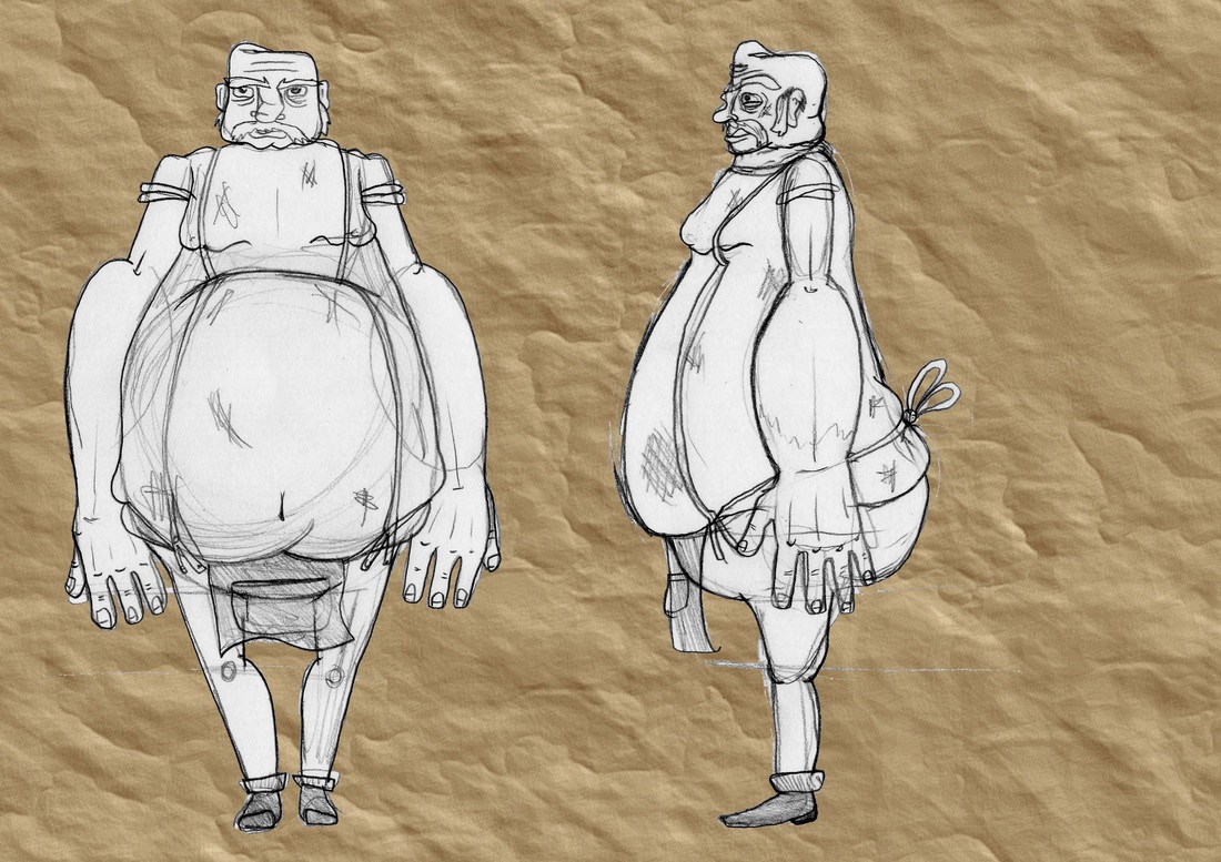
Pablo did the rough character designs in 3d and they were successful in a way to show the audience how we'd like them to look like and to get some feed back on them. want the captain to be taller than the cook as they need to be of equal strength and pound for pound I feel a heavier man would easily over power the captain if he was short. Gemma agreed and we were also told by manning as Pablo had mentioned that the cook was too round and not pear shaped enough. I had originally resisted as I thought this would give him a feminine demeanor But then agreed to change the character design after realizing we'd be struggling against the cooks size for most of the film if he was too large. For example the original cook wouldn't be able to run up our stairs as he was too wide and we would have way more problems with clipping and simple things such as fitting up on a stool. For practical reasons as well as style I redrew both characters taking in to consideration the issues we'd been told about.
Sinead
Sinead
Penultimate model turnarounds as seen in production bible!
|
|
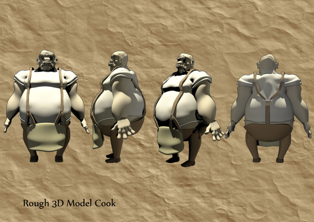
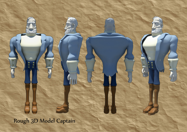
Rough CG Models of captain and cook 12/12/11
Some Scenery...
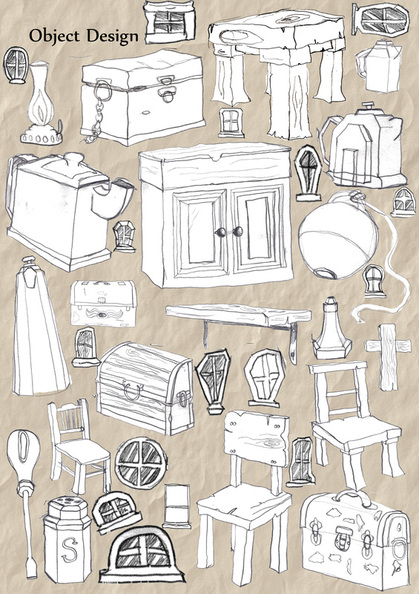
Some 3D Object Design...
|
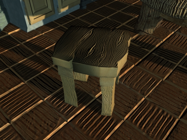
For object design we wanted to create a worn Edwardian design focusing mainly on cheap wooden furniture. We wanted to make sure however that the world didn't look too ugly as after our first render with displacement maps the world felt quite lifeless so we want to make sure that are objects are quite smooth and nonthreatening.
We took a lot of inspiration from games such as the CG Monkey Island and World of Warcraft for there smooth yet exaggerated objects as we felt they were both designed for quick releases and to run on less capable PCs which we hope will cut back on render times in the long run. by Pablo |
|
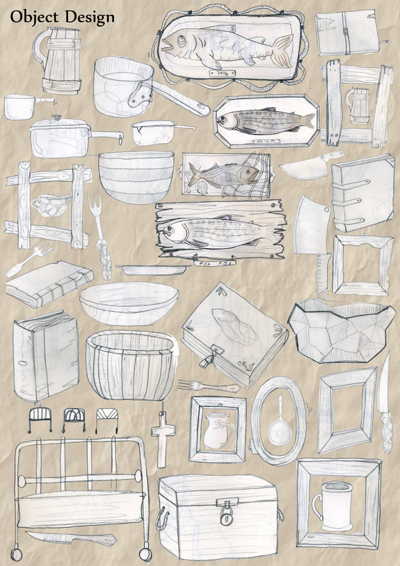
Some 2d object design...
|
|
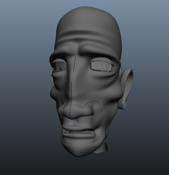
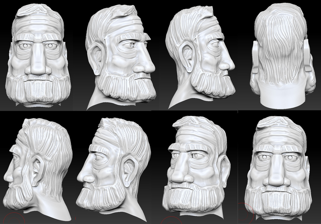
Cook's head


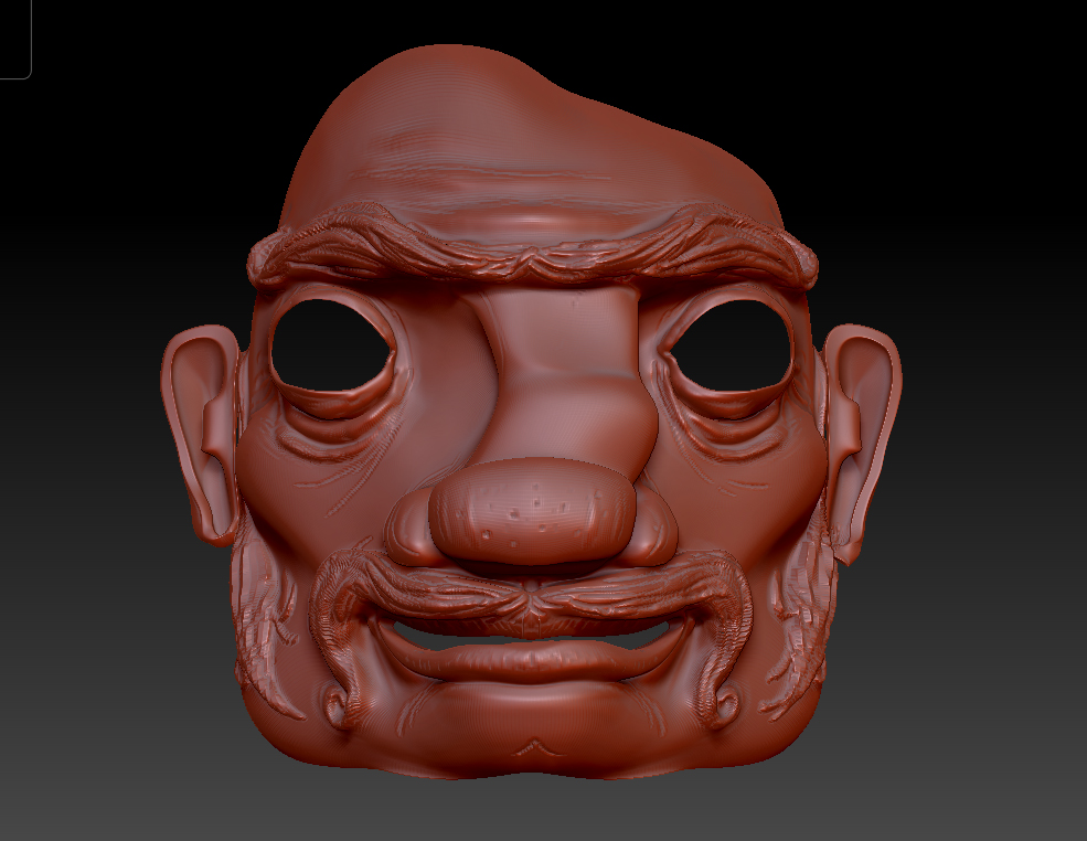
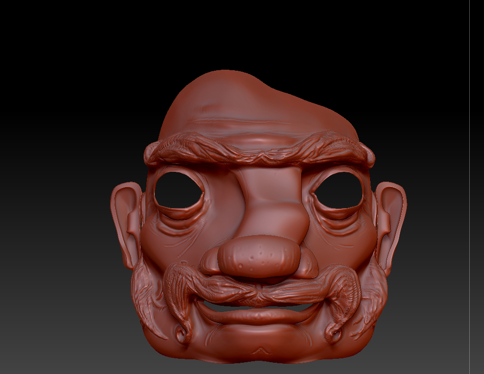

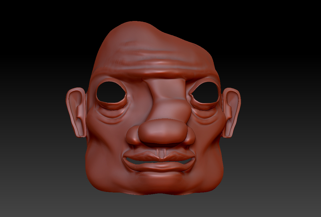
Cook's head modeled and sculpted in zbrush by Sinead
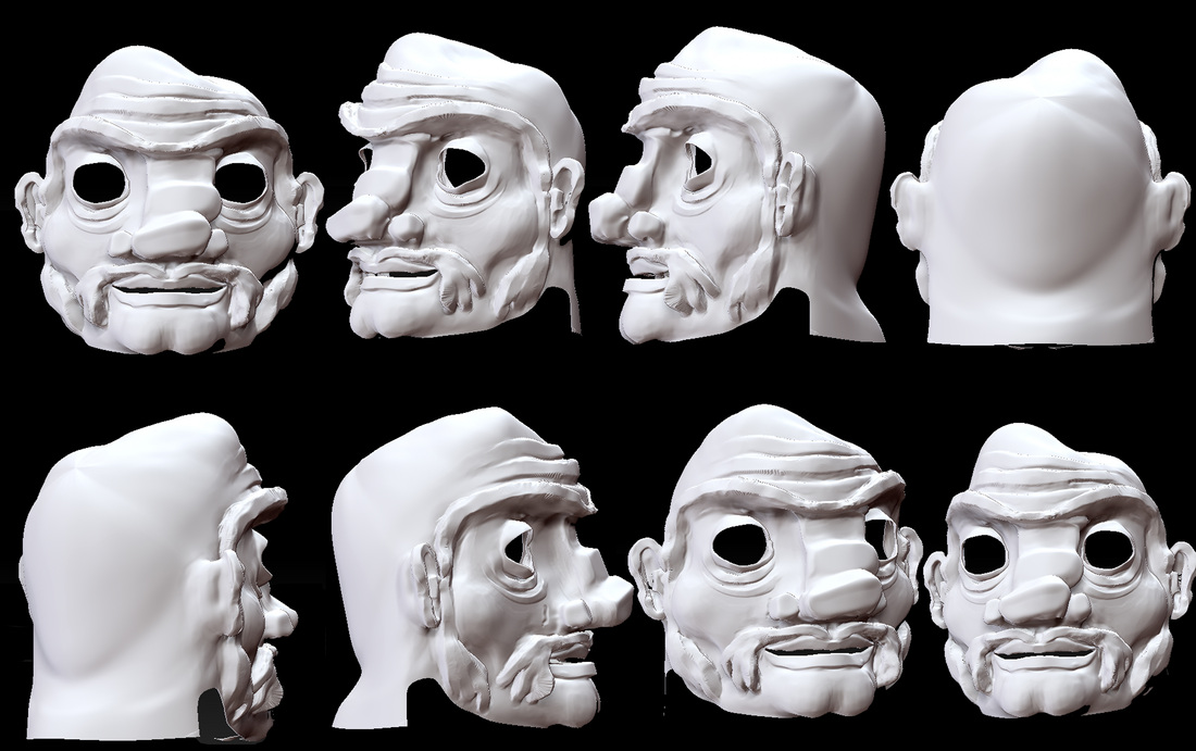
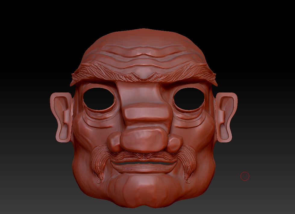
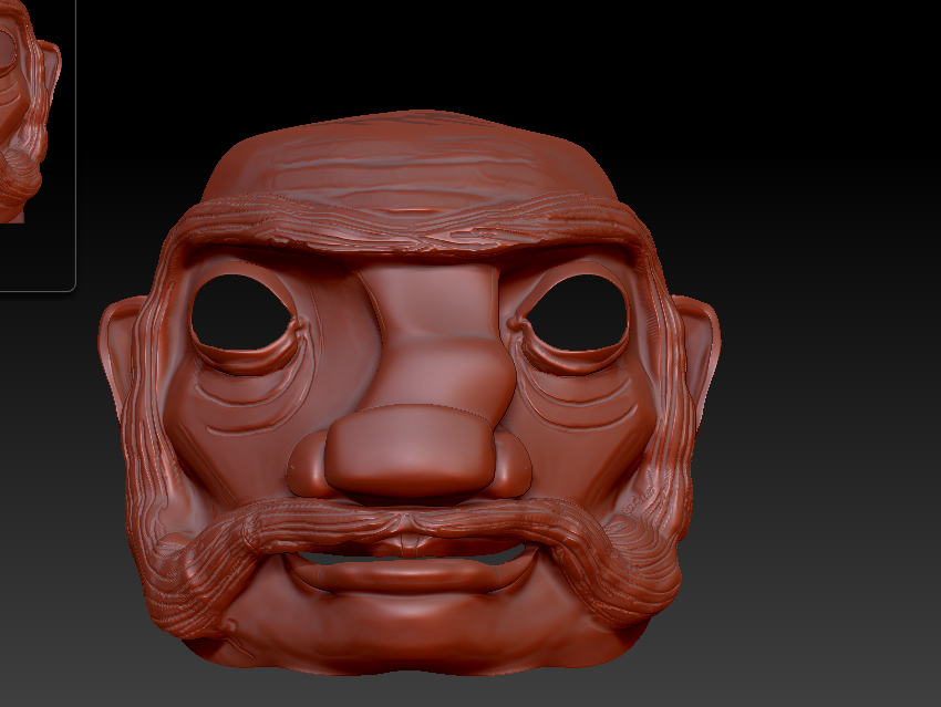
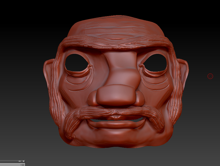
Captain heads x5
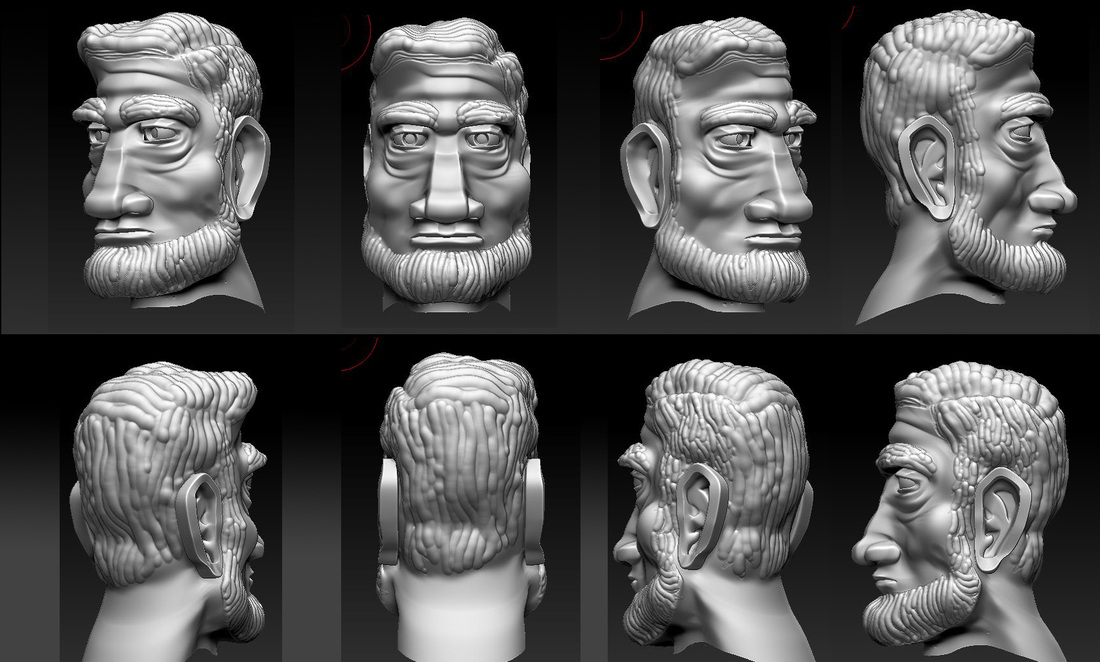
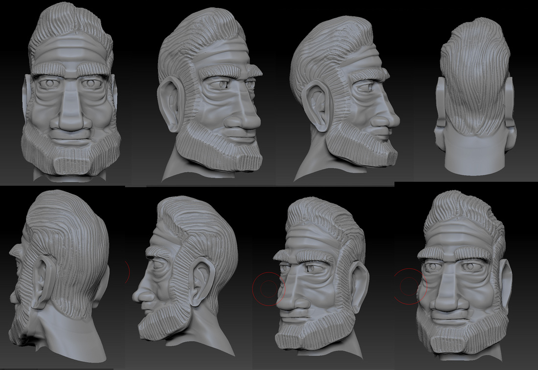
|
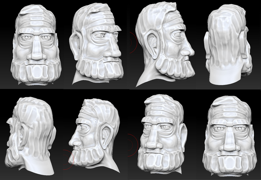
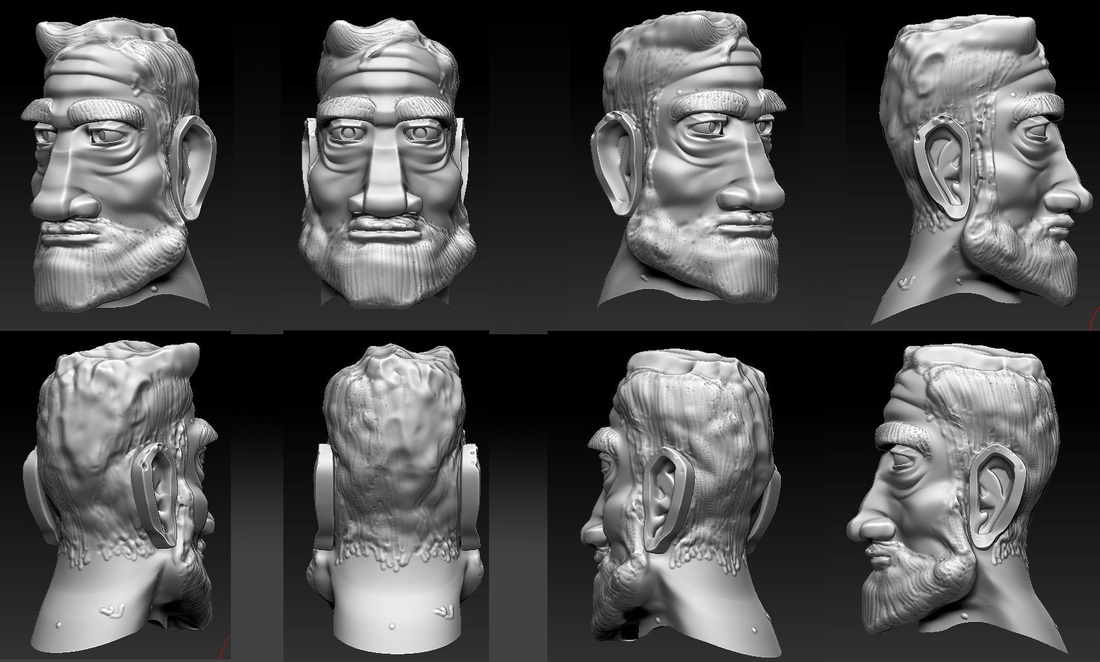
So we tried making them more tactile..After the first head came across as too cold we decided to try making them look "hand made" taking inspiration from sculpting materials.
The most successfull were the first two and the last in this series. The first two up at the top there looking like clay or plasticene and the bottom one ment to be reminisant of a wooden sculpt. Sculpt by Pablo Words By Sinead |
Final Story board
This is just a quick little slide show. Showing the new storyboard. I used the templates from gemma this time so the frames were all 16:9!! This is super helpfull for when we need to scan and take them into after effects and premier in the shots before we drew them in A5 size and they didn't quite fit into the 16:9 shape.
After Leonie and Manning's input I think we have something that makes alot of sence story wise and now all we have to do is tidy the shots up so it looks as nice shot wise and the film language reads as well as the new story! Though there are a few little bits and pieces left to disscuss.
After Leonie and Manning's input I think we have something that makes alot of sence story wise and now all we have to do is tidy the shots up so it looks as nice shot wise and the film language reads as well as the new story! Though there are a few little bits and pieces left to disscuss.
Bed scene development
|
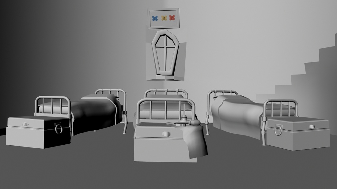
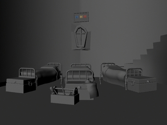
|
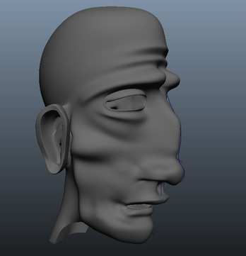
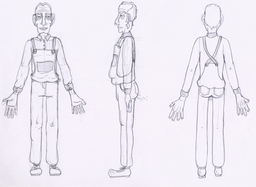
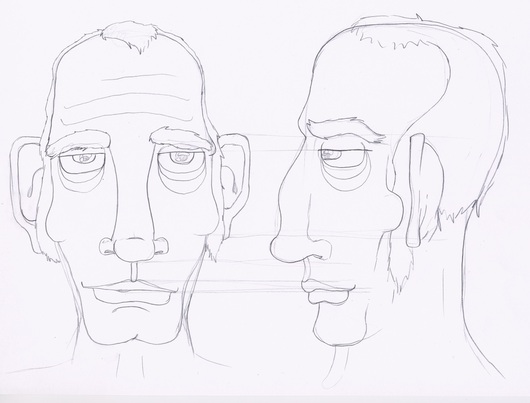
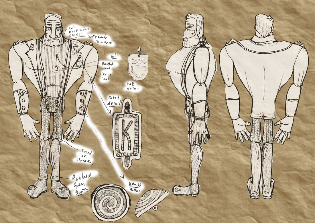
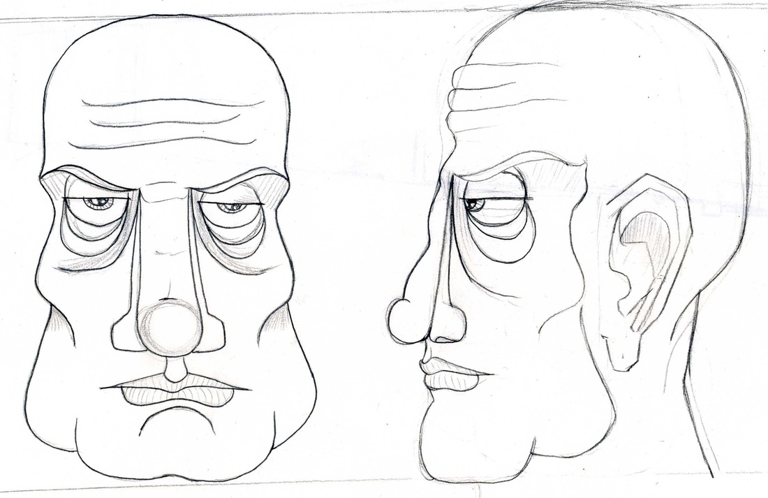
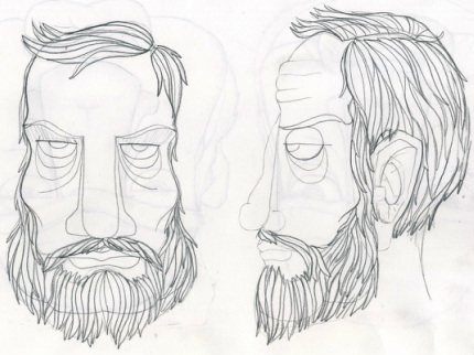
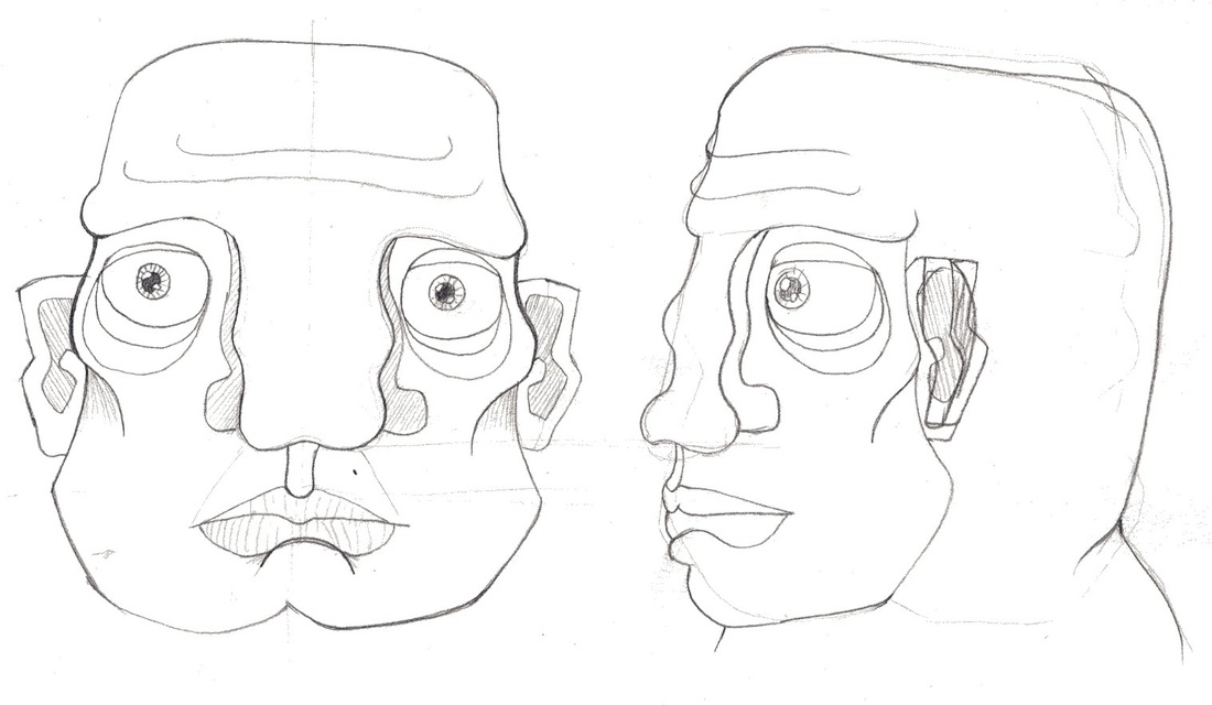
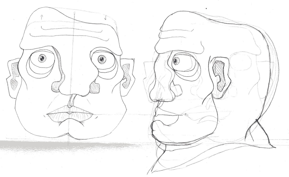
Final Character Head Design. 03/Nov/2011
In CG the head is a very complex thing to make as you have to keep in mind the topology. In order to make the character animate with blend shapes we needed to make sure the face is modelled in this specific way with correct topology. Considering the complexity and time it takes to model the characters heads we decided to design these separately and model them first.
Introducing...
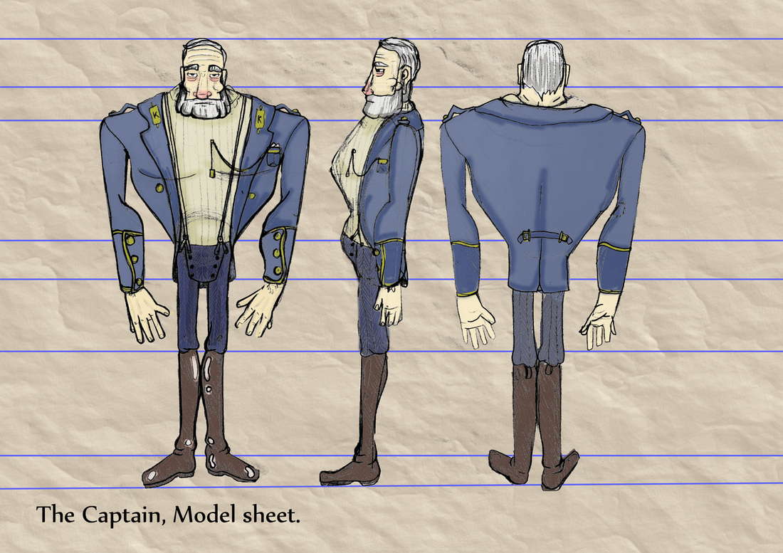
The Captain, aka Capt. Tommy Marsh
|
|
I should mention here because of the process we have decided to model the character completely bald and then add hair separately in Z Brush after the orginal character head is modelled. Above is the captain character in his final design with hair on the right and and without on the left. Pablo will be modelling the Captains head while I model the Cook's head.
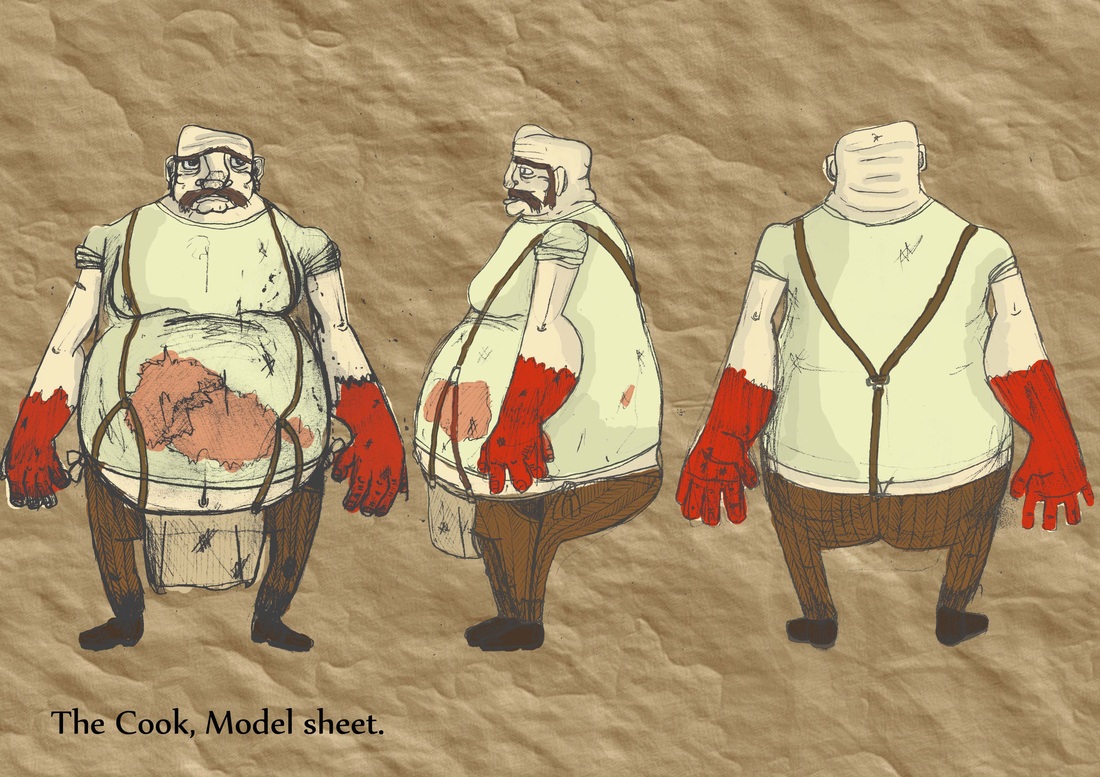
The Cook, aka "Chubby" Ducat
|
|
Again to create the correct topology its vital to model the character symmetrical first them distort his nose and head to give him the exaggerated almost cartoonist feel. As with the captain above I'll have to make another character sheet with him with the areas that will have hair on so I'll know where to add the detail once we come to Zbrush.
Personalities
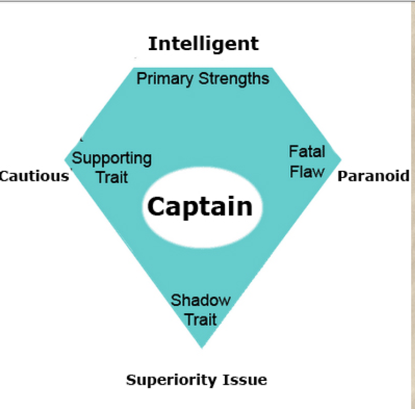
|
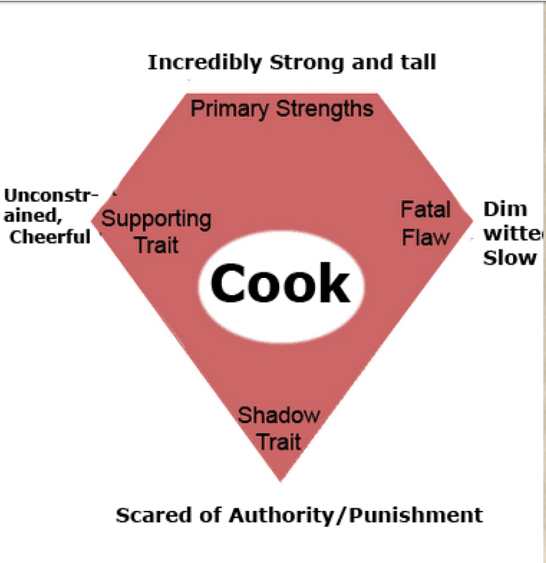
|
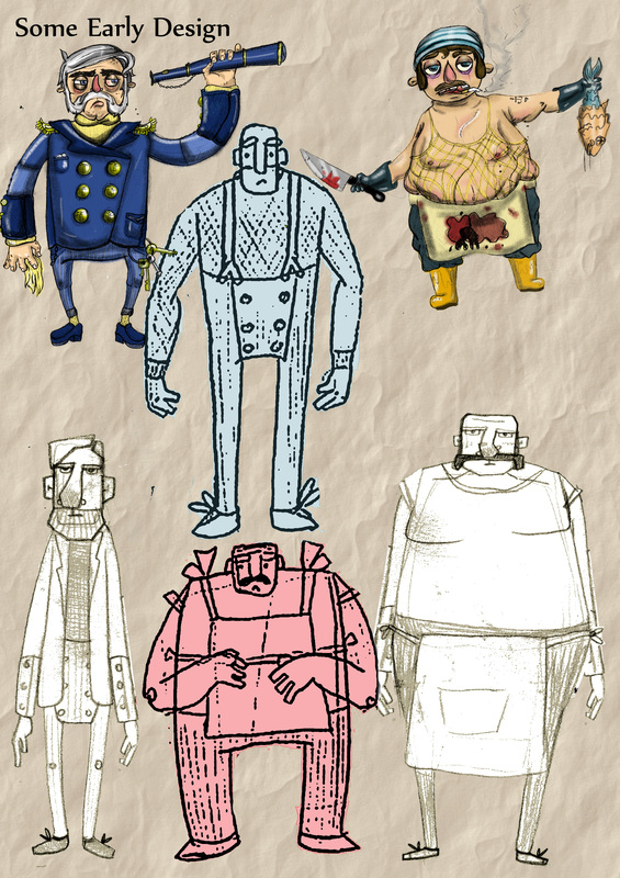
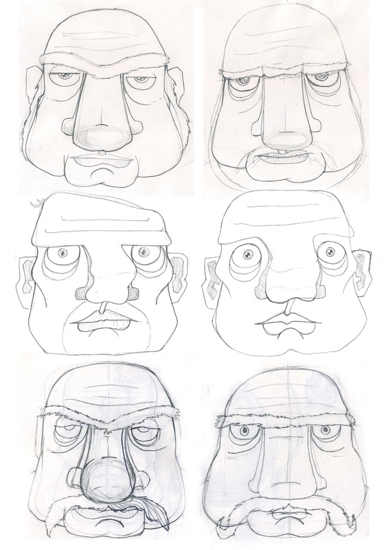
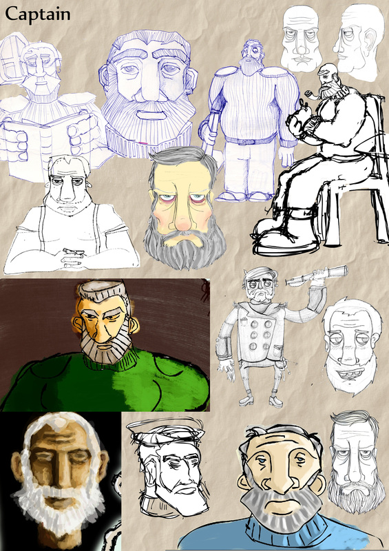
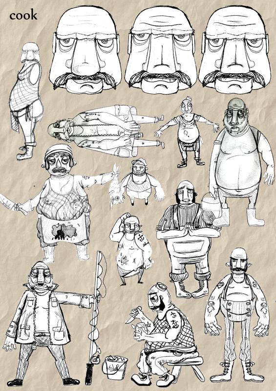
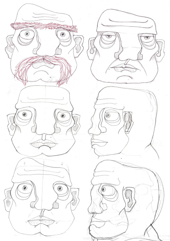
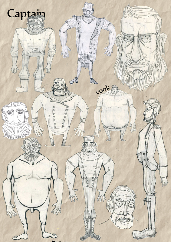
Gallery of Character Design
I made 2 new sketch books and filled them with designs for the Cook and Captain, as well as already having lots of sketches from flash and previous sketch books. Here's a huge library of all of the designs we've made throughout the process.
|
|
A medley of designs from Pablo and Sinead
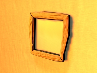
Model and rendering tests. 25/Oct/2011
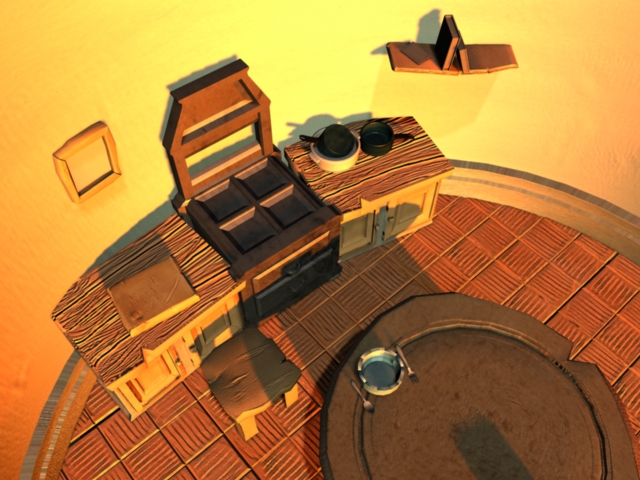
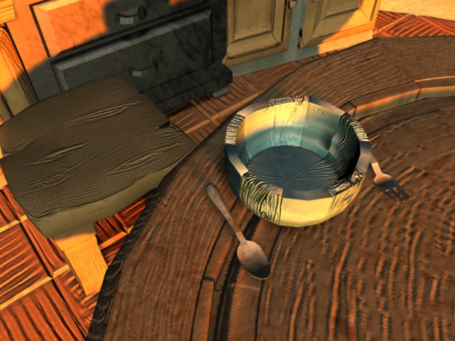
This week has been mainly used in the pursuit of making part of the kitchen to see if our modeling style would work and how good our texturing methods looked put into a simple scene.
The most successful object in the world was the frame as seen here on the right. We have a few experiments with light as well the harsh blue light gives the scene a more eerie look over all and I think it's closer to our imagined world. The Orange light gives the world a more meditarainian feel taking it away from our Welsh/Scottish/Cornish setting . I believe the reason for its mediteranian look is partly the details such as the terracotta flooring which should probably be a grey flagstone considering its local. After reading "If it's purple someones going to die: The power of color in visual storytelling" By Paul Bellantoni we discovered that Blue was the color of powerlessness as seen in the office scenes of "American Beauty" so we decided to keep the scenes blue in the begining. But we have descussed keeping the final scene where they fight in the lighthouse "crows nest" the colors of action which is red and danger which is yellow this will be shown by the dawn light.
The most successful object in the world was the frame as seen here on the right. We have a few experiments with light as well the harsh blue light gives the scene a more eerie look over all and I think it's closer to our imagined world. The Orange light gives the world a more meditarainian feel taking it away from our Welsh/Scottish/Cornish setting . I believe the reason for its mediteranian look is partly the details such as the terracotta flooring which should probably be a grey flagstone considering its local. After reading "If it's purple someones going to die: The power of color in visual storytelling" By Paul Bellantoni we discovered that Blue was the color of powerlessness as seen in the office scenes of "American Beauty" so we decided to keep the scenes blue in the begining. But we have descussed keeping the final scene where they fight in the lighthouse "crows nest" the colors of action which is red and danger which is yellow this will be shown by the dawn light.


Animatic feed back 25/Oct/2011
We received feed back from a good selection of people I'm going to write a paragraph on each then reiterate the issues brought up in bullet points below each paragraph:
Osamah
“I just had some points to raise about the story. I think at the start you should keep the shot where we cut to the dead man's face and then pull out, cause that was a nice touch. What's critical here I think is establishing the doubt relationship between the chef and captain really early on. You are using the waving with the dead body shot in doing so, but I think it needs to be clearer from an audience point of view. So some tinkering is needed here I think.
Also, although annoying to solve, there needs to be a clear motivation why the chef is the one who buries the dead man, and why is the captain going up at the same time ? Is it because the chef is the hands-on guy? I think it needs to be set up in a way that it's read quicker.
The meal sequence I think plays out nicely. After that scene, I still think there should be a clear motivation for the chef to run to the top of the light house, which we talked about earlier :P Why does he run upstairs ?
On the other hand, I think the fight sequence makes more sense now that they break inside the light house. Obviously, there are still refinements with holds and timing of sequences, but I am sure that's not what you're trying to go for in this first rough.
I think the story has great potential to be a nice piece, it needs a bit of ironing and should end up being a solid piece narrative :) “
Gemma
"First off, love the visual style you have going here, the drawings are all really strong and your composition test on Youtube is stunning.
As a rough animatic, there is obviously tweaking to be done, but specifically there are some timing/overlapping frames/jumps that are making the story really difficult to read. There is also disappearing/miscoloured bowls and backgrounds that are mixing up your sequences. The sound comes into this as well, the atmospheric wind outside is a nice touch, but without noises and grunts from the men, it's making it quite confusing. Either have sound going throughout or take it out for now.
Osamah makes some good points about motivations etc. Experiment with ways to make all the actions/emotions read as clearly as possible. I was very confused by the ending, just before the fight, I didn't know which character was which and why the fight suddenly broke out... I think you'll have to explain it to me!
Overall I'm really excited by your film and think it will be a fantastic piece. Perhaps you could speed up your timings a little too, it felt a bit slow in places (Plus it will cut down the work load!). And I must say, I was expecting a 'joke' ending rather than a tragic one. It suits the style you're going for, but I was expecting something really random! "
the establishment of the suspicion between the two could perhaps take longer.
the one guy with the binoculars seems to instantly suspect the other guy who
is burying the body....burying the body is a reasonable course of action i suppose .....
otherwise a communication to the mainland about an autopsy/police investigation.
but we can believe it is normal for him to be buried .
who dug the hole? surely the binoculared guy was aware that was going on.
presumably the binocular/blue guy is pissed that's why he's dancing on the tables.
the table scenes are a bit weird with bowls disappearing in a shot or two.
and seeing the red guy at complete table on his own without bowls then spinning the table
which has bowls confusing......is some of this imagined?
and the end of that scene is ambiguous he cant turn the table because the other guy is sitting there.
they are all lighthouse nuts presumably......as red guy is cooking a stuffed fish.
'spose its all there when unpacked.
then the blue guy is signalling with a light and is seen doing it through a window
is that downstairs?
then they meet upstairs later i suppose ...not a clear division here i suppose the real imagery and different sound effects will help distinguish it as a later in time ie a separate scene
ambiguity about the architecture ie the rails location its convex/concave state directing where it is ...thats confusing for me should it be opposite direction?
but the story works i think.
Sandra (Pabs Mam)
Not sure whether a completely fresh look at it -as we have talked about the scenario this summer But here goes:-
09 secs blurred not sure why
get everything then except for the wounds on the guy that dies looks like wound marks but could have been the broken wood and airs as impact
very good especially beds scene
got the poisoning suspicion by both parties
when bloke has fishing rod not sure why and leaves lighthouse without it - is it imp?
also not sure re falling scene of pink character
Boat gone & cut away rope good
next night good tension but not sure what blue guy has his finger on looks like a bottle first but in morning like a front door bell!
the final scene at the top of the lighthouse with the fight and final charge over rotten wood outside but fall down the stairs inside is this confusing? or have I got it wrong
really liked the feel of it esp the view in the am with seagull and view of lighthouse and setting
Bry:
Zara:
My Parents:
The main things we found with our feed back was the issues same issues kept cropping up mainly being the events leading up to the fight on the final day. (why does the cook run upstairs, why does the captain begin the fight?)
We also have a major issue with how people are reading the lighthouse structure. For example the recurring feedback was not understanding that the missing railing was from a banister that led to an interior stair case so people were assuming they were falling outside the light house.
Some issues were brought up with the characters and how the script pays more attention to the captain rather than the cook and how the cook remains less suspicious or be so. The hierarchy was brought in to question and we need to prove the cooks' subservience at some point and separate the characters boldly. I think we need to put more clues in to the final film as people aren't always understanding the ending straight away.
We also have many technical issues witch have been brought up many times from timing to frames clipping we hope to get a clearer and more precise animatic by week six to get the animatic more clear.
Osamah
“I just had some points to raise about the story. I think at the start you should keep the shot where we cut to the dead man's face and then pull out, cause that was a nice touch. What's critical here I think is establishing the doubt relationship between the chef and captain really early on. You are using the waving with the dead body shot in doing so, but I think it needs to be clearer from an audience point of view. So some tinkering is needed here I think.
Also, although annoying to solve, there needs to be a clear motivation why the chef is the one who buries the dead man, and why is the captain going up at the same time ? Is it because the chef is the hands-on guy? I think it needs to be set up in a way that it's read quicker.
The meal sequence I think plays out nicely. After that scene, I still think there should be a clear motivation for the chef to run to the top of the light house, which we talked about earlier :P Why does he run upstairs ?
On the other hand, I think the fight sequence makes more sense now that they break inside the light house. Obviously, there are still refinements with holds and timing of sequences, but I am sure that's not what you're trying to go for in this first rough.
I think the story has great potential to be a nice piece, it needs a bit of ironing and should end up being a solid piece narrative :) “
- Suspicion is lacking for the beginning
- A reason for the cook to run upstairs
- Hierarchy
- Lighthouse railing
- Chef burying the engineer.
Gemma
"First off, love the visual style you have going here, the drawings are all really strong and your composition test on Youtube is stunning.
As a rough animatic, there is obviously tweaking to be done, but specifically there are some timing/overlapping frames/jumps that are making the story really difficult to read. There is also disappearing/miscoloured bowls and backgrounds that are mixing up your sequences. The sound comes into this as well, the atmospheric wind outside is a nice touch, but without noises and grunts from the men, it's making it quite confusing. Either have sound going throughout or take it out for now.
Osamah makes some good points about motivations etc. Experiment with ways to make all the actions/emotions read as clearly as possible. I was very confused by the ending, just before the fight, I didn't know which character was which and why the fight suddenly broke out... I think you'll have to explain it to me!
Overall I'm really excited by your film and think it will be a fantastic piece. Perhaps you could speed up your timings a little too, it felt a bit slow in places (Plus it will cut down the work load!). And I must say, I was expecting a 'joke' ending rather than a tragic one. It suits the style you're going for, but I was expecting something really random! "
- Need Sounds for men
- Why the fight breaks out
- A reason for why the cook heads upstairs
- Slow
- Timing, overlapping etc.
- Why the fight breaks out
- Too many cuts, more stage driven.
the establishment of the suspicion between the two could perhaps take longer.
the one guy with the binoculars seems to instantly suspect the other guy who
is burying the body....burying the body is a reasonable course of action i suppose .....
otherwise a communication to the mainland about an autopsy/police investigation.
but we can believe it is normal for him to be buried .
who dug the hole? surely the binoculared guy was aware that was going on.
presumably the binocular/blue guy is pissed that's why he's dancing on the tables.
the table scenes are a bit weird with bowls disappearing in a shot or two.
and seeing the red guy at complete table on his own without bowls then spinning the table
which has bowls confusing......is some of this imagined?
and the end of that scene is ambiguous he cant turn the table because the other guy is sitting there.
they are all lighthouse nuts presumably......as red guy is cooking a stuffed fish.
'spose its all there when unpacked.
then the blue guy is signalling with a light and is seen doing it through a window
is that downstairs?
then they meet upstairs later i suppose ...not a clear division here i suppose the real imagery and different sound effects will help distinguish it as a later in time ie a separate scene
ambiguity about the architecture ie the rails location its convex/concave state directing where it is ...thats confusing for me should it be opposite direction?
but the story works i think.
- Beginning Suspicion weak
- Captain gets too suspicious while cook is unaware
- How d they get upstairs?
- Lighthouse architecture
- Unsure about the burial scene
Sandra (Pabs Mam)
Not sure whether a completely fresh look at it -as we have talked about the scenario this summer But here goes:-
09 secs blurred not sure why
get everything then except for the wounds on the guy that dies looks like wound marks but could have been the broken wood and airs as impact
very good especially beds scene
got the poisoning suspicion by both parties
when bloke has fishing rod not sure why and leaves lighthouse without it - is it imp?
also not sure re falling scene of pink character
Boat gone & cut away rope good
next night good tension but not sure what blue guy has his finger on looks like a bottle first but in morning like a front door bell!
the final scene at the top of the lighthouse with the fight and final charge over rotten wood outside but fall down the stairs inside is this confusing? or have I got it wrong
really liked the feel of it esp the view in the am with seagull and view of lighthouse and setting
- Chase scene sketchy
- Morse code scene sketchy
- Lighthouse architecture
- Wounds on engineer confusing
- Why the fight starts.
- Had issues with the sound for some reason was the only person who heard the sound version. He said we should keep the tense music for only the most intense scenes keeping it fairly neutral throughout the day to day scenes. I completely agree but I would like a full score really.
- Timing issues which we both agreed on. Its only our first go so yes we will sort that.
- Longer hold on dead guys face which is again just timing unfortunately.
- Manning suggested we make the chopping scene more threatening to add drama to the scene where the soup is finally revealed.
- The seagull making the two guys jump needs to be clearer be that a louder bang or even just the seagull cawing loudly.
- Manning also made the point that each of the characters needs to be "unaware" of the others suspicion and perhaps the factor that drives their final fight is the discovery of their crew mates paranoia.
- He also suggested having the captain come across the pipe earlier as he comes to the crows nest.
- He also suggested another visual gag we could add of having the lighthouse look more broken as if the engineer was lazy and thus led to his own down fall.
- And finally suggested we consider the silent dialogue scenes far more carefully. We need to make sure the scenes are set up to keep up with the "rules" or cinematography e.g having each character at the first third of the shot to show their talking to one another.
- Didn't get the ending first go
Bry:
- Said the part with the gun needed to be better insinuated. I think we could do that with the color or model of the gun also I think the captain needs to be holding the gun or we need an aerial shot on it to make it clear what he has.
- Also on the color scheme she suggests having more reds and yellows to suggest danger at the more drama parts
- And a really good idea on the fight scene having the sea and sky be the colors of the cook and captain to illustrate the fight between them
- Again she would like more signals about the first guys demise. But she really liked the ending and found it clever a very good sign!!
- As with a few of the viewers she did struggle to see that the railing was on the inside of the light house she suggested having a shot where we see down into the lighthouse to where the first guy dies to show really clearly where the guys will fall.
- Got the ending first go.
Zara:
- Also brought up the point that the body needs to be seen for longer
- She also suggested that we needed a shot where both the characters look at the body perhaps react and this could answer the problem of people not understanding who buried the body
- As with all the viewers she didn't understand why the cook runs up stairs. She suggested that maybe the cook would run up the stairs to retrieve a weapon as the captain has one now. I could see that being a logical reason perhaps theres another gun upstairs or perhaps he wants to get the engineers tool box.
- Zara also made an excellent point on the characters and how perhaps having them red and blue was a bad idea as red is strongly associated with guilt or murder. Perhaps we need them in secondary colors to show their guilt is ambiguous or change cooks color to a more "innocent" tone.
- And as Bry she suggested the cook and captain have very different silhouettes to show differentiation between them.
- Got the ending first go
My Parents:
- my mum suggested like Manning we need to plant the clues earlier and especially show more attention to the spike and the railing so they aren't new concepts in the films climax
- My dad got the ending immediately.
- My mum had to be explained to it's interesting how it seems to be a 50/50 split at the moment on who gets it straight away and who need help.
- Both didn't understand why the cook runs upstairs we though fear was a good enough excuse.
- They both laughed at the dead body humor witch is good as did Bry actually witch is a good sign.
The main things we found with our feed back was the issues same issues kept cropping up mainly being the events leading up to the fight on the final day. (why does the cook run upstairs, why does the captain begin the fight?)
We also have a major issue with how people are reading the lighthouse structure. For example the recurring feedback was not understanding that the missing railing was from a banister that led to an interior stair case so people were assuming they were falling outside the light house.
Some issues were brought up with the characters and how the script pays more attention to the captain rather than the cook and how the cook remains less suspicious or be so. The hierarchy was brought in to question and we need to prove the cooks' subservience at some point and separate the characters boldly. I think we need to put more clues in to the final film as people aren't always understanding the ending straight away.
We also have many technical issues witch have been brought up many times from timing to frames clipping we hope to get a clearer and more precise animatic by week six to get the animatic more clear.
Posters from Caroline's lecture.
|
Story Board 10/October/2011
Scripting, re-scripting, storyboard, re-storyboarding,
We came across the true story of the film during the end of last summer. While watching a documentary on the northern lighthouse company who pioneered the way lighthouses were built in Scotland, they mentioned in passing the mysterious dissapearance from one of their lighthouses of 3 men. After some research into the case we discovered a diary written by the missing men describing the tense atmosphere of the lost men preying and crying before their disappearance. There was a treasure trove on-line of many people trying to explain the mystery. Some legends claim the three were seen as ghosts leaving the island on a boat. Some claimed it was alien abduction, or that they were taken by fairies, a freak tidal wave, even the more sinister theory of one of the crew going mad and dispatching of the other two before throwing himself to the sea.
We began developing a story where the 3 men find their mysterious fates. After some discussion we talked about having the two characters as this would show case each of our technical abilities as we'd have one character each to animate, model and rig so we'd each have someone to show case in out different show reels. So we ended up with an ending very quickly and then a beginning. Both myself and Pablo decided to write a few versions of the script after talking over our story we each wrote 2 separate scripts then came together and wrote a script that was a co-operation of both our ideas and scripts.
We began developing a story where the 3 men find their mysterious fates. After some discussion we talked about having the two characters as this would show case each of our technical abilities as we'd have one character each to animate, model and rig so we'd each have someone to show case in out different show reels. So we ended up with an ending very quickly and then a beginning. Both myself and Pablo decided to write a few versions of the script after talking over our story we each wrote 2 separate scripts then came together and wrote a script that was a co-operation of both our ideas and scripts.
So we split the script in half and each story boarded half. Then came together and made the below story board pinned up on the board.
We stared to re-script and re-storyboard this original and it became more readable and more effective in terms of our ideals and what we wanted to portray. We got Osama to come read it for us and tell us what needed to be clearer in the eyes of someone who was outside the loop so to speak. It was because of his input we decided to colour code the cook and captain in the final animatic. We added a lot of scenes to the story and we took a lot out so finally we ended up with something more tangible. We then decided to scan digitise and colour our animatic. I drew the line art as it were and Pablo coloured the backgrounds and begun putting it together in After Effects. Below is our final result animatic wise:
I wanted to upload the version I made with music from Hitchcock's vertigo. But it was cut very badly so Pablo didn't, it was more of an experiment with the sound I know we want the music at the critical moments in the beginning reveal the fight and final reveal. Though the middle is debatable wether it needs a heavy sound track or not.
Eye Candy... Island designs
Early island concept art by Sinead
INSPIRATION TIME!!! 04/October/2011
|
|
There's a lot of things to love about this one. The cell shading style of it is nice as well as the chunky brute character design I especially like the hands and fingers of Biorn as well at the bead in the beard. The story is cute and funny with some dark elements that really add to the fun and the bleak ending really makes you feel sad for luck less Bjorn! The clean feel was nice too.
Sinead |
|
The characters are simple and beautiful and their water color paint like texture and color really make this film succeed. It's a nice way to show CG becoming more like our watercolor inspiration. Through watching this we realized the power of having such abstract painted sky was really effective. We're planning on researching painterly textures and having a few goes and making them for the objects and characters.
Sinead |
|
|
|
The character designs for Mac the larger character was very similar to what we were looking for as we were looking for very menacing and powerful characters. The scenery was beautiful and we'd like to look into shaders to avoid that lambert1 feel and give our island some life but we
still would want more paint like textures for the island. Pablo |
The very first presentation 03/October/2011
Going in Monday for our first presentation was exiting I really wanted to get up there and get some proper feedback on what we had so far. Going almost last was a bit disspointing but oh well. We showed a small portion of the reference we had accumulated over summer as well as a quick story overview and some earlier sketches of the characters. We'd had more plot and story development at this stage than real visual drawings. Below is the presentation we showed.
Feedback
The feedback was mainly positive. Though a point was brought up about the very first character designs being too close to a film called the Pearce sisters. While the design process continues we both expect the designs to move on and change from those designs. I think we can all agree that the character designs need a lot of work and once in cg they'll be very different from the first sketches really.
Another point brought forward was my reluctance to bring forward the story quite yet. Both myself and Pablo aren't creative writers by nature and I personally think we need more feedback on the twists that are involved throughout the film, so giving away the plot before we've fully decided on it could taint the groups interpretation of the piece. We're hoping to introduce this to the group and a other select groups at animatic point!
Both Manning and Leonie have pointed out the plot is quite lengthy or big enough to inspire an entire full production. This will hopefully be scaled down to a good sized production by script writing and story boarding. Manning also made the point that the style of film we wanted to base this one on black comedies like films by the Coen Brothers and Wes Anderson the layout which are usually long and meandering aren't incredibly suitable for a short. I've taken this on board and tried to distill the themes like recurring motifs, the color theory, repeats of the same shot so the plot comes full circle visually and subtle hints in decor to try and keep the black comedy, Coen Bros kinda feel.
Sinead
Summer Tests. Aug-Sept 2011
Tests
Over the summer we spent a lot of time researching techniques required for this idea. We've always wanted to make this film feel very handcrafted as shown above in our character and landscape inspiration. I've managed to complete some renders of some of my tests. After discussing our idea we decided that we needed to do some research into certain techniques to really sell the film which were water, rigging, facial animation, lighting and modelling.
Modelling
Neither of us have successfully made a face in maya with a decent topology. So we looked into a few methods into modelling faces suitable for animation and texturing as the project. We found out some new techniques for modelling using EP curve tool and some methods of UV mapping and started to look at displacement maps within Maya to give our characters a more rough organic look.
|
Rigging/Facial Animation
Due to the theme of our final theme we have to create very expressive characters with detailed facial expressions to express the mental states they are going through. We've been experimenting with blendshapes as well as joint tools to create a suitable rig. The model to the right is courtesy of a magazine called Maya Essentials. |
|
|
|
Lighting/Water
Major issue we had to overcome in order to consider this piece was water and lighting as we needed to create a convincing environment. Lighting is something we need to master as we are dealing with two characters which aren't communicating via words but silent expressions, so we need lighting to set the atmosphere and strengthen the expressions of the two crew mates. |
|
Modelling
Neither of us have successfully made a face in maya with a decent topology. So we looked into a few methods into modelling faces suitable for animation and texturing as the project. We found out some new techniques for modelling using EP curve tool and some methods of UV mapping and started to look at displacement maps within Maya to give our characters a more rough organic look. While still keeping away from the real life and go with more man made versions of human form like painting and toys. |
|
Photo Research
Since we both live in Swansea, we visited the Mumbles lighthouse to take some reference photos in order to get some ideas for the piece.
This trip gave us some idea on how we'd like our island to look and sound. One thing we didnt consider before we visited the lighthouse was how wild and overgrown the island would be the vegetation is very unique and windswept which we'd love to implement.
Here's a very small selection of the 300 pictures we took and some other inspiration
